It's a lonely life...that of the necromancer, er freelancer

A blog by a designer and illustrator, for designers and illustrators which may contain musings on art, movies and random weirdness.

Wednesday, November 12, 2014

Winter Sketch

With winter quickly approaching, and in eager anticipation of the holidays, I decided to do a pen and ink and marker sketch of an idea that I have had in my head for a while.  I love that late afternoon light in the fall, just before the sun goes down, when the tops of trees and buildings are bathed in an orange glow, and the base of the building is in a blue or purple shadow.


I wanted to incorporate that into a sketch of a fantasy couple greeting people as they arrive at heir home, a stone tower, to join with them in a winter feast.

Here is the black and white sketch:


Here is the colored version:


I may want to do this as a series showing the interior of the tower hall with the festivities in full swing.

Finishing Up Some Paintings

I have a short attention span. I get very excited about many things, but unless I have a hard deadline or I am getting paid for it, I generally lose interest sometime after the idea has been worked out in a sketch. It is because of this personality flaw that I have several paintings that have sat started, but not finished for 3 or 4 years. That's right, years. Recently I decided I was going to make a concerted effort to actually finish some of these projects. I work as a graphic designer, but i have been setting aside one day (or at least one afternoon) a week, to go to my studio and chip away at the paintings bit by bit. Here they are in order of attack:

 1. Arthur Dimmesdale and Hester Prynne


This is more of a painting exercise than a full-blown piece. I have always been a fan of the 1979 PBS adaptation of Nathaniel Hawthorne's  novel, especially the two leads John Heard and Meg Foster.
I decided to do a portrait of them as they appear in the forest. I did a post about another Scarlet-Letter inspired piece back in May( http://georgecouragecreative.blogspot.com/2014/05/the-scarlet-letter.html) This picture might look familiar if you read that post. It is basically a rendering of a still from the movie. One down.

2. Ghost in a graveyard


 Several years ago, my wife had an appointment in Newburyport, MA. I was on my own for an hour or so, and since it was a pleasant early fall evening, and I didn't have any money to go shopping at the local bookstore, I went exploring in a nearby Victoeian-era graveyard. I was the only living person there, and as the sun began to set, I imagined what a great setting it would be for seeing a ghost. I took several photos and began a painting.  Cut to...last week when i finally finished it. Two down.

3. Hammond Castle


This is another piece that has been in the works for several years. A panoramic view of Hammond Castle in Gloucester, MA This one is not quite complete, but I'm chipping away at it. Two to go.

4. Henry Hudson and the Mermaid


This is the oldest painting in the bunch. I probably started it in 2008. The painting of the ship's rigging has proved daunting. Also, originally I had wanted to include a quote from Henry Hudson's log that described the mermaid. Still plugging away on this one too.
One to go.

Saturday, September 27, 2014

The Ipswich Mermaid

When I was in high school our drama department did a performance of Peter Blackmore's play "Miranda". If you are not familiar with this work, it is a comedy about a London doctor who goes to Cornwall on holiday and is captured (or rescued) by a mermaid who talks him into taking her back to London, disguised as an invalid patient. She takes up residence in his flat, much to the consternation of his wife, and proceeds to seduce every man in sight, which leads to a lot of humorous complications. It was made into a movie in 1948 starring Glynnis Johns. (Google it).
In both the play and the movie version Miranda is a "full-time" mermaid  (no "Splash" style, leg-to-tail-conversions) and gets around by either being carried, or pushed around in a wheelchair.
The girl who played Miranda in our high school version, was a lovely girl named Denise Brockelbank, who had beautiful long, dark, crinkly hair, (which she inexplicably cut just a few weeks before the show went up, forcing her to wear a wig, but that's a story for another time). The vision of her as a mermaid, sitting in a beautiful dress, in a wheelchair, was an image that has stuck with me for many years. This was pretty much the flashpoint for my interest in Mermaids. A few years later, in college, I  did a marker drawing of my impression of that vision. The face and hands of the mermaid were courtesy of an Italian fashion model in an issue of Vogue. The stylized hair and dress were the result of an art-school obsession with Alphonse Mucha.


Over the years, I kept coming back to this image again and again. I always wanted to do something more with it. I kept kicking around the idea of a painting. I even had my wife pose for me.


Finally, I decided to get off my butt and actually finish some projects that have been hanging around (in my head or otherwise) for years. The first inspiration came when I saw this old postcard of the lighthouse in Ipswich, MA, my home town. You can read more about the lighthouse here: http://www.newenglandlighthouses.net/ipswich-range-lights-history.html


  Ipswich has always held a special significance for me. I grew up in Ipswich and have many fond memories of visiting Cranes Beach.
The original lighthouse was moved to Edgartown on Martha's Vineyard in 1939, so it was long gone before I came on the scene, but I knew about it because the lighthouse keepers house, which our church used to rent for summer events, didn't burn down until the 1970's, and I had actually been in on several occasions. I now had a definite place to set the mermaid in.
The next inspiration was coming across this old advertisement for wicker "invalid chair".


Now I had something to put the mermaid in. The original play was written in 1948, and was set in the late 40's, but there was something very appealing to me about the Victorian time period, especially since the lighthouse would have been gone by the 1940's. There is something more magical about the fashions, and also the modesty of the period. You could believe that a mermaid might have an easier time concealing herself as an invalid in a large "invalid chair" and keeping her tail under a long Victorian dress. Who would know?
I looked for an appropriately-styled Victorian dress. I was going to keep most of the original sketch, if I could, but having an actual dress in mind would be more helpful. I found one online. Now I had a dress to dress her in.


I was ready to start painting. I took a 8" x 10" canvas and started to rough in the painting. I pretty much stuck with the overall look of the original drawing that I did back in college, but I adjusted some of the details.


The next step was adding in more detail and enriching the color.


It quickly became apparent that the hair was too stylized to work with the more realistic background, and that the hands were really large and strangely positioned. I found the position of the hands appealing for some reason in the original sketch. They seemed to reinforce the vulnerability of a mermaid stuck on dry land, but they were way too big, and as my wife pointed out, it would be "painful to hold you hands like that". I had my wife pose for me just to try it out and see.
We came up with a more realistic, and less painful-looking position.


I repainted the hair, and the hands. I added in gloss highlights on the tail, the eyes and the water. Sprayed it with varnish, and framed it in a white wooden frame.
Here is the final painting.


Monday, July 21, 2014

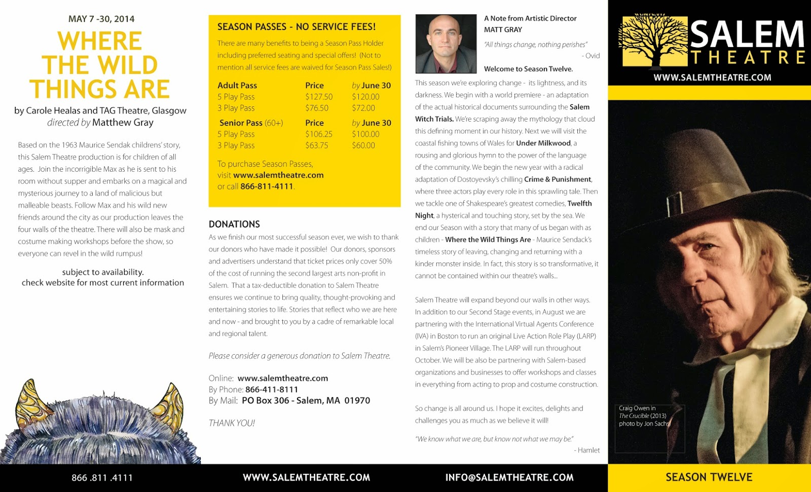
The New Salem Theatre Brochure

The latest brochure for the 12th Season of the Salem Theatre (formerly known as the STC). The hot-off-the-presses brochure includes the new logo and branding and some very fun show identity illustrations by artist Heather Reid. This is my third brochure for the Salem-based company, and my first for the new Artistic Director Matthew Gray, and new Managing Director Kate Ventimiglia.


Friday, July 18, 2014

The Complete Works of Shakespeare (Abridged) Theatre Backdrop

I have been working on a canvas backdrop for the Hub Theatre production of The Complete Works of Shakespeare (Abridged) . The director of the theatre, Lauren Elias, contacted me through Marc Ewart, a stage manager, prop-builder, and all-around crafty person I have worked with on several other productions. They needed a lightweight canvas backdrop that could be used as a curtain for the actors to slip behind for the many quick changes required for this show.
Lauren had some different ideas about what she wanted for an image. One idea was to have an image of the original Globe Theatre, and be labeled as such, The other idea was to have large comedy and tragedy masks. She wanted it to have an "old-timey" feel, look interesting, but not so interesting as to draw focus from the actors.
I did some research and collected as many images of the Globe as I could. The two I was most attracted to were both taken from an old period engraving showing the Thames River, and the adjacent section of London including the Globe. One was a detail.


The other was a more modern interpretation of the same structures.


I liked the line work of the  engraving however, it would need to be simplified in order to be painted, and read clearly. Both images were just too busy. I tried a simple layout.


I had done some research on comedy and tragedy masks, but frankly did not like the idea of the masks alone. I then had the idea of combining the masks and the globe into one composition.


Lauren liked the basic idea, but it was still way too busy, and needed "The Globe" type as well.
I introduced a decorative frame, both to contain the image, make it look more theatrical, and to simplify by eliminating a lot of  unnecessary detail.


The backdrop was originally set up to be 12 feet wide by 9 feet high. It soon became apparent that this would be impractical for the performance space, so it was reduced to 9 feet by 7 feet. The resizing squashed the images of the comedy/tragedy masks. I also wanted to simulate the coloring I was going to go for on the final painted version. So I came up with this, final version of the sketch.


Lauren approved this version. Now it was time to start painting. Marc purchased a10 foot by 20 foot canvas dropcloth. It was the only way we could get a  piece of canvas large enough without having to stitch it together ourselves. We found a wall at my office large enough to pin the canvas to. We then primed it  with gesso. The cloth was very absorbent so it took nearly a gallon for one coat. After the first coat was dry, we mixed up a combination of yellow-ochre and gesso to give the background the yellow tone of aged parchment.


Next, we used a Panasonic Digital Projector to project the sketch onto the canvas.


Using a brush and raw umber acrylic paint, Marc and I outlined the image.
Here is the first day's progress. You can see that we have outlined all of the major areas, and roughed in some areas with various shades of brown.


The second day was spent coloring the various areas. Although I originally wanted to keep the banner strictly monochromatic, I soon realized that some color would help the banner read more clearly in a theater. I tried to keep all of the colors subtle earth-tones. The hardest part was keeping the colors consistent and wet enough to cover a large area before drying out.


Here is the banner in progress.


Here is the final banner.


And here is the final banner on stage on opening night.
Managing Director and co-founder Lauren Elias said " ...the banner is beyond my wildest dreams! "
Thank you Lauren!


The Complete Works of Shakespeare (abridged) is playing at the Club Café , 209 Columbus Ave, Boston from July 18th through August 2nd. Their website is here: www.hubtheatreboston.org/

Tuesday, July 1, 2014

An Unkindness of Ravens

The Scarlet Letter Press in Salem, MA is sponsoring an art show inspired by Edgar Allen Poe. Called "Spirits of the Dead" the show is seeking Poe-inspired artwork, hand-made jewelry& crafts for an October 2014 Gallery Show. They are participating in a national month of recognition to support the City of Boston's installation of a life-sized Poe bronze, sculpted by Stefanie Rocknak. The sculpture is being installed around October 7th, the anniversary of Poe's death. Previews of the clay sculpt, can be seen at www.bostonpoe.org .
I want to enter the show, and have been kicking around an idea that I originally executed when I was attending MassArt, way back in the stone age. If I remember correctly, our illustration teacher, Tom O'Hara, gave us groupings of animals to illustrate, such as a gaggle of geese, a clique of owls, etc. Some of the names for groupings of animals were quite surprising, such as a "murder" of crows. The animals were assigned at random by drawing a slip of paper with the name of the animal on it, literally out of a hat.
My animal ended up being the raven, which are referred to in a group as an "unkindness". It was up to the individual student to decide how to visually represent the grouping. Most of these took the form of a visual pun. The more imaginative, the better.
At the time I had been reading a collection of Poe's short stories for one of my English classes, and of course "The Raven" sprang immediately to mind. I have always been a fan of Poe, partly because of his writing, but also because he seemed like such a glorious nut-job.
Now images of Poe with a raven are hardly original, so for my interpretation, I needed to up the anté. I wanted Poe, sitting at his writing desk, being menaced and annoyed by not just a single raven, but by a ridiculous number of ravens. I don't remember how many I had in the original, but I had them sitting on his desk, the back of his chair, pulling his hair, pecking at his pen, dipping their beak in his inkwell and flying around the room. Poe had a look of exasperation and distress on his face. The effect was more comical than horrific. I remember that people seemed to like it.
In the 30 years since I graduated, after several moves and a divorce, I lost almost all of my college work, including the original piece.
Recently I decided to try and "re-imagine" the original. The original piece was vertical in orientation, and Poe was dead center, surrounded by ravens as if in the center of a storm. It was also done in black and white. The new version was going to be a bit less symmetrical, a bit more historically accurate. The original had a very fanciful interpretation of Poe's chair, which looked more like a medieval throne, and his desk was very plain, and pretty much empty except for some books and papers. For the new version, I wanted something closer to what Poe may have actually used. I also wanted to include a bust of the Pallas Athena. I gathered my reference materials, photographs of Poe, period furniture, books, Athena, and lots and lots of raven pictures.
Here is what I came up with in the new sketch.


I scanned the sketch, cleaned it up, and then started a value study using Photoshop. I placed the linework on a separate layer, and then using that as a guide for selecting areas, began coloring in and shading the black and white drawing. I wanted to be able to play around with the lighting at the sketch stage in a way that would allow me to change things easily. I have three sources of light in the image, two candles and a fireplace. The lighting was going to be tricky to make look convincing.
The left foreground also seemed a bit empty, so I added another, larger raven into the foreground. This is where I am at now with the value sketch. The big question now is, what size to I make the finished piece, and do I keep it in black and white, or do I add color? if I add color, do I make it a spot color such as red? Should I add the title "An Unkindness of Ravens" to the picture? Stay tuned.


Here is day one results of the actual painting. It is on an 8" x 10" stretched canvas.


Here is the latest version of the painting after laying in the color over the monochromatic underpainting.


Here is the final piece I delivered to the Scarlet Letter Press this week. I refined the painting and highlights, and added a coat of gloss medium over the eyes of the birds and Poe, as well as the inkwell, the buttons on his waistcoat and the ring on his left hand. I then gave the entire piece a coat of spray varnish. It is mounted into a black wooden box frame. You can see it on display at the Scarlet Letter Press in Salem through the month of October.


Tuesday, June 24, 2014

Merrimack Valley Community Music School Logo


A few weeks ago, my business partner Rae at New Arts Collaborative and I were contacted by The Merrimack Valley Community Music School,  a community-based, non-profit music school that is dedicated to helping people connect through music education and performance. They were very interested in having a logo developed for the school to use on their print materials and website. We scheduled a conference call with Valerie Walton, the Executive Director to get an idea of what the school was looking for and to try to brainstorm some ideas. Valerie had sent us some links to examples of websites/logos that she liked including the Northeast Organic Farming Association (www.nofamass.org/), The Essex County Community Foundation (http://eccf.org/), and the Arlington Center for the Arts (www.acarts.org/).
Their own website was very plain and offered few clues:


During the conference it became apparent that the school needed to achieve three goals: 1) Show visually and quickly that it was a music school, 2) Distinguish itself from other music schools in the area, 3) Contain a tagline and/or visual that would convey or encapsulate their mission statement.
Some of the other goals we discussed. Easy to read, easy to use, usable in black and white or color, designed so that it can be shrunk or enlarged easily without losing quality. 

The key words that I heard during our discussion was community, an important part of their identity, and growth, both in the sense of growing the school, and in the sense of personal growth. On their website they say:
 "Music at its best brings people together and creates positive energy within a community as a common language that bonds us beyond cultural, social and economic differences. Music education is a powerful way to learn about oneself and to explore the possibilities that lie within each of us, to reach for our highest good and potential". 
One of the essential ideas was that this school was for the entire community, and could help you grow at any stage of your life, from young child to adult. This was also the key to what distinguished this school from other schools, that were geared more for training school-aged children.

I started thinking about growth metaphors. And we decided that “Growing through music” might be a good tagline. This phrase would percolate in my brain for a while.

The first thing I did after the conference call, was start researching music forms and notations. G-clefs, musical notes, stops, time notations.  I started playing around with the forms. This was the first round. A I usually do, I started designing in black and white, playing with the forms in Adobe Illustrator.


We then received feedback from Valerie, as well as the School's Director, Charles Leinbach. He thought that the emphasis should be on the words "Merrimack Valley Community" rather than on "Music School". He also didn't think that the music notations were working. However in one of her e-mails Valerie suggested trying; "Bass (or F clef) and Treble (or G clef) Bass is lower and treble is higher as they sit on the GRAND STAFF A music chord (or arpeggio or phrase) often is thought of as going from low to high.  I wonder about a plant or vine somehow growing up the grand staff. Possibly too complicated."
 The idea of a growing plant seemed to fit, especially as one of their preferred colors was green. Then I came across this image of a note:


It struck me how leaf-like the flag on the top of the note appeared. That got me to thinking about the base of the note being like a seed-pod. I had a bit of a eureka moment. The image literally came to me in my sleep. Upon waking, I did a quick sketch in my notepad. 

Developing that idea, this is what I came up with this for the second round:


I wanted to make sure that the client was clear on the intended metaphor and added the notations explaining the components as extra insurance. We sent these off, and the feedback was positive.
They really liked the central idea. Now it was refining the text, positioning and color.
 The biggest problem was integrating the text. One of the reasons I wanted to emphasize  "Music School" instead of "Merrimack Valley Community" was because of the length of that text. "Music School" is nice and short. So I had to play around with it a bit to get it to work. The client also wanted to lose the "berries", and preferred the stalk of the musical note/plant, to break both the "ground" it was placed into as well as the frame it was contained in. Here is round 3.
I have developed both a vertical as well as a horizontally-oriented  version of the logo. I have also selected a complementary orange color to go with the green. The colors were Pantone 1375 (orange), Pantone 349 (dark green) and Pantone 376 (light green).
As usual I developed the logo to be modular, comprised of a logo-mark, and a word-mark, which can be used together or separately in different configurations. This allows the most flexibility in application.
Here is the guide I developed showing the final logo.


The client was very happy with the result.

Wednesday, June 18, 2014

New Salem Theatre Logo

One of my regular clients for the past 5 years has been the Salem Theatre Company http://www.salemtheatre.com/. I was first brought into the company by Executive Director Gary LaParl, whom I had met when I was a member of the Salem Arts Association and Matteo Pangallo, the original founder of the company, and a co-worker at the Peabody Essex Museum. They brought me in to design a print brochure (the first) for the milestone sixth season and develop a branding system for their promotional materials.

The Salem Theatre Company (STC) was founded in 2002 by Artistic Director, Matteo Pangallo. To implement his vision of a semi-professional local theater for Salem and the North Shore, he established a Board of Directors (BOD) and a Board of Advisors (BOA), and led the first several seasons. During his tenure, and under the original BOD, STC was incorporated as 501(c)(3 ) Salem Arts Center, Inc.

Matteo had designed the original STC logo, unfortunately it was created in Microsoft Word, and had very limited applicability. It looked like this:


The print materials for the first few seasons were sometimes striking, but were also uneven in execution. There was no STC "look". One of my jobs was to refine the existing logo, create a standard framework for the posters, business cards, postcards, ads, signage and other materials for the theatre, all on a very tight, non-profit budget.

I streamlined the STC logo, and recreated it as a vector-based graphic, selected a color palette, and set up a template for show posters, event posters, and the season brochure. I also developed identities for the shows in the Season 6 and the Season 7 brochures. Here is the revised logo:


When John Fogle became artistic director of the STC in 2009, he took over developing the show identities. (He had an extensive background in photography and design). I continued to produce the show posters and special event posters. That continued until this year, when John stepped down as artistic director. A new artistic director, Matthew Gray, was appointed in the spring of 2014. He brought a tremendous amount of energy and new ideas to the Salem Theatre and immediately went in a new direction, including completely revamping the existing logo.

Apparently on Matthew's first visit to Salem with his wife Kelly, they had visited one of the old cemeteries that crowd the center of Salem. The trees there are particularly old and impressive. This struck Matthew as a powerful symbol, not only of Salem, but also what he wanted the theatre to be and stand for. An active and inter-active part of the community.


Matthew and Gary LaParl, had developed a prototype of what they wanted:


Although I liked the look of it. I saw some immediate problems. The tree component had been grabbed from  a website and was not available for licensing. Also, there was no tie-in with the existing logo's colors or typefaces. Complicating the identity was the fact that they had decided to drop "company" from the logo.The Salem Theatre Company (STC) would be henceforth known as simply as the Salem Theatre.Matthew


Once again, there was a good-looking logo that was basically unusable. My job became creating a version of this logo idea that was workable, legal, and bridged the jump from the old logo to the new.
First I had to find the right tree. I actually maintain a file of tree photos called "Sexy Trees". I like trees and find them to be visually fascinating. Using one of my tree photos as reference, I redrew the existing tree by hand. It needed to be similar to the one in the prototype, without being a copy.
I came up with this:


Although still somewhat stylized, it was less symmetrical and therefore a bit more realistic. Matthew and Gary had already selected Trebuchet as one of the typefaces for the new logo. In order to make some connection with the old system, I used Myriad Pro Regular for the "Salem" face. I also used the original "STC yellow" (Pantone122) as the background color. I developed both a vertically-oriented and horizontally-oriented version of the logo.


After review, Gary and Matthew both wanted a version of the logo where the tree branches broke the border of the frame. So I made a version with the tree inside the box was one object, and the branches outside the box were another. That way if the logo appears on a black background, the extending branches would stand out.


The new logo was approved and is currently being rolled out on various materials including a 12th Season brochure, but more about that later.