It's a lonely life...that of the necromancer, er freelancer

A blog by a designer and illustrator, for designers and illustrators which may contain musings on art, movies and random weirdness.

Thursday, December 17, 2009

Clever Self Promo Ad


I don't usually post stuff from other blogs on here, but in this case I'm going to make an exception, because this one was both effective, and made me laugh. It is a self promotional ad for a creative agency (McCann Erickson) that decided to bring the ultimate argument in "who rules in logo design" to the table.The link is here: http://adsoftheworld.com/media/print/mccann_erickson_jes

Tuesday, December 15, 2009

LOGO development: Christ The Rock Fellowship

Here is a logo-design project I finished recently. A logo for a church in Worcester, MA. The process took a couple of months. The client said they preferred a square logo and wanted it to contain the basic motifs of the cross, some interpretation of "the rock" and the look of either in color or in shape, of the churches stained-glass windows. Here are my initial sketches. I like sketching out ideas with pen and paper before I get into working it on the computer. I think it gives you a better feel for the logo, and keeps you from getting locked in to a particular font or color too soon. You can see that I came up with the basic workable idea in the first round of sketches.


Here is a photo of one of the churches' windows.


The next step was to refine the sketches, as you can see, I had the name wrong on the initial sketches, it was "Christ the Rock Fellowship", not "Christ of the Rock Church"
I tried a variety of colors, and used some fonts that I though would be good choices given the church is a fairly conservative entity.


Although the client's stated preference was for a square logo, I felt that a more horizontal orientation could also work, and included it in the first round.
The following rounds were refinements in font choice, color, and the relationships between the component elements.


The client had trouble choosing between the square version and the more linear version, and asked me to refine both of them.


This is the final round. The client decided that they really liked both of the logos, and wanted to use both of them for different applications.

Thursday, December 10, 2009

Henry Hudson and the Mermaid-Work in Progress

A few months ago I was reading about the English explorer Henry Hudson. (You know, he "discovered" Manhattan, the Hudson River and Hudson Bay are both named after him) I was surprised by a couple of things, one, that he disappeared in Hudson Bay after his crew mutinied and set him, his son, and a few loyal men adrift in a small open boat, that his remains were never found, and that in 1608, while sailing near Norway, he wrote in his logbook:

"This morning one of our companie looking over the boord saw a Mermaid...from Navill upward her back and breasts were like a woman's, her body as big as one of us; her skin was very white; and long haire hanging down behind, of color black; in her going downe they saw her tayle, which was like the tayle of a porposse and speckled like a Macrell."

Hudson was one of few historical figures to not only site a mermaid but to make an entry of it in his log. This gave me an idea for a painting. So as soon as I read this I did a couple of small thumbnail drawings.

The first one was just to get the idea down. On the second one I started thinking more about the individual elements, composition, and lighting, making written notations on the thumbnail.The next step was research, collecting reference sailing images of ships of the period, costume, Henry Hudson, the Norwegian coastline, waves, mackerals and porpoises. Once I had that gathered I did a more finished drawing in pencil and marker to work out basic layout, lighting and colors.


As you can see the original sketch is pretty loose, and is much wider than I had originally planned. I was playing around at this stage with the size relationship between the mermaid and the ship. I wanted her to be close enough to the viewer to dominate the foreground, but not so large that you couldn't still make out the man on board the ship who is seeing her. At this point I did a more refined compositional and color study. I was also trying to decide at this point if I should include the text of the log entry in the painting itself, which would have made it a very narrow and vertically oriented painting. (I decided against it)


The final step, was to get the painting onto a panel. I used a 12" x 24" gessoed masonite panel.I drew in the image based on the sketches. As I was working , I decided to make the mermaid even larger than it appears on the sketch. I started with a just 2 colors, manganese blue and burnt sienna, roughing in the largest areas.


This is where I am at now. I will work in more detail and color as I go. I will post my progress as I go.


Here is the latest update on the painting...

Thursday, December 3, 2009

Nemo's Daughter


A painting that I finished a while ago, that is in the "Nemo" theme. I always thought that Nemo should have a daughter. In the otherwise execrable 1997 version of 20,000 Leagues Under the Sea, Nemo (Michael Caine) does have one, (Mia Sara) and I liked how it played. The painting is my own version of what she might look like. Oddly enough the latest issue of The League of Extraordinary Gentlemen: 1910 largely concerns the death of Nemo and the reluctant succession of his daughter as captain of the Nautilus.

Monday, November 30, 2009

Character Sketches


Here are some character sketches for a children's book I have been working on, "Piewacket, Ship's Cat of Salem". My wife Amy wrote the story, and she has been trying to get me to illustrate it for months. The story is about a ship's cat on board the Friendship, an early 19th century merchant ship that sailed from Salem, to Sumatra and other ports of call in southeast Asia, to trade for pepper and other spices. It was not uncommon for ships to have a ship's cat, in order to keep the rats and mice from eating or destroying the cargo. The cat in the story is based on our own cat Piewacket, who is a very large Russian Gray. The story is finished, but the artwork is definitely a work-in-progress. The top sketch is of the two main characters, Piwacket the cat, and Thomas, the cabin boy. Below are sketches for the Captain, a ship's rat, the Farmer, who brings the cat to the Friendship, and the First Mate.

Tuesday, November 24, 2009

Sketching


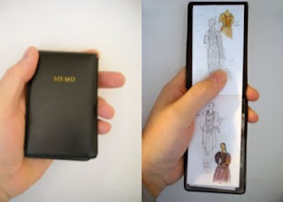
Anyone who has known me for any amount of time, realizes that I hardly ever leave home without a tiny sketchpad and a pen. Most of my drawing for the last few years has been done in a series of small memo books 4.25" x 2.75", filled with plain white paper.
The size is unobtrusive, and will fit in almost any pocket nicely, and can travel anywhere. I have always liked drawing small anyway. I buy plain white paper memo pads from CVS and cut them to size.


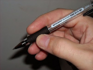
I also use the best pen ever made, it is a Mitsubishi UM-151, a uniball pen with extremely black, nearly-waterproof, archival ink and a .028" tip. They are not available at your local stationary store and had to be ordered from Japan through Jetpens.com. I covet these pens, and love drawing with them.


I will also sometimes carry a small Windsor Newton watercolor kit, which is compact, self-contained, and very versatile. That means I can do small, quick sketches almost anywhere.

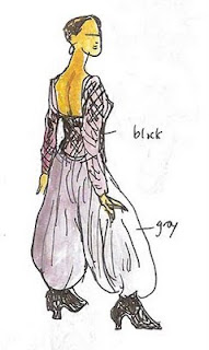
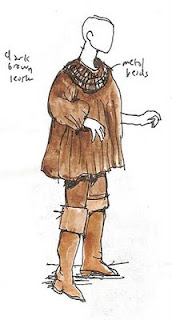
Here are some sketches that I did recently of the Iris Apfel show at the Peabody Essex Museum using this method.

Naughty and Nice


Here is a poster I just completed for the Salem Theatre Company. It is for their Christmas Repertory show, Dylan Thomas' "A Child's Christmas in Wales" (NICE) and "The Eight:The Reindeer Monologues" (NAUGHTY). The challenge was to come up with an attention-getting poster/image that would represent both shows without being offensive,
or misleading. Since everyone I know is having a difficult time financially this year, I thought that the lump of coal in the stocking image was appropriate. I just wish I had put "AIG" or "Wall Street" on the stocking.

Saturday, November 21, 2009

20,000 Leagues


I have always been a big fan of Disney's 1954 film version of Jules Verne's 20,000 Leagues Under the Sea. I don't think there have been any subsequent versions that can touch it in terms of performance; James Mason's elegant and tortured Nemo, or in terms of production design; Harper Goff's design for the Nautilus is still a marvel 55 years later. I was able to see a technicolor print of the movie on the big screen at the Harvard Film Archive last year, and it still holds up remarkably well. My obsession with this movie finds its way into sketches, doodles and an occasional painting. Here is a color sketch that I did recently of Nemo on the Nautilus. It might end up as a painting someday.

Tuesday, November 17, 2009

Graphic Novel Anyone?


Some work in my "not paying now but maybe someday" category. Some thumbnails for a page from a proposed graphic novel about WWI-era subchasers. Wooden fore-runners of the PT boat that were built specifically to hunt and destroy Nazi subs.

Latest Project


Finally getting around to starting a blog. Thought i would start with my latest work, a poster for the Mugford Street Players production of "The Trip to Bountiful" at the Little Theatre (Firehouse) in Marblehead. It was done in watercolor on illustration board. The original is about 11x17.