It's a lonely life...that of the necromancer, er freelancer

A blog by a designer and illustrator, for designers and illustrators which may contain musings on art, movies and random weirdness.

Tuesday, December 21, 2010

The Dickens You Say!

A client recently hired me to do some Photoshop work on a photo so that it could be printed and given as a Christmas gift. I'm posting this partly to show what I am capable of doing in Photoshop, nothing too fancy, but definitley took an artist's eye.

Here is the original photo. It is a picture of actor J.T. Turner, who does an annual reading of Charles Dicken's "Christmas Carol" as who else, Charles Dickens. He had this lovely photo taken of himself in his 19th-century Dickensian costume, the only problem was the decidedly 20th-century building in the background.


It was fairly easy to isolate the foreground elements and eliminate the background, replacing it with color sampled from the snow shadow area.
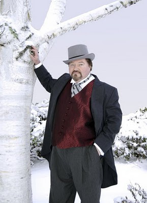


So far, so good. Now the client asked me to make it look more like an illustration, similar to a technique that I developed for use on several posters. I couldn't do it by just by running a Photoshop filter on the original photo as that almost always looks like what it is; a Photoshop filter run on a photo. It needed to look more hand drawn than that. I solved the problem by making a line drawing of the photo, tracing a print of the photo on vellum, and then scanning it into Photoshop.
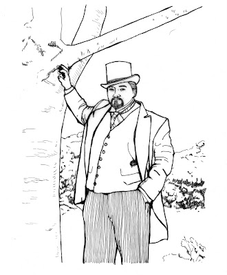


I then selected the white areas of the flat art, inversed the selection so that only the black was selected, and then copied and pasted the black line art onto a new
layer in Photoshop. I then took the original photo, ran a modified watercolor filter on it, and pasted it on the layer beneath the line art. Some areas of the line art did not line up exactly and needed to be modified, as did some of the areas of the underlying photo. For instance the area around the eyes needed to be cleaned up, and the side of the coat extended. Once everything was lined up to my satisfaction, i flattened the document. Here is the finished product.
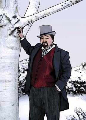


You get the illustrative style of line art, with the tonal gradations of a photo.

Sunday, December 5, 2010

Firedrops!

A client of mine has been in the process of developing and marketing a product called "Firedrops". These are organic sugar drops loaded with cayenne pepper, which if taken at the first hints of a cold, will almost literally burn the sick right out of you. At first she made them in small batches at home, but they became so popular that she looked into having them manufactured in larger, industrial quantities. As she did this, she realized that they would need a definite identity. She asked me to help.

She liked the idea of a shield motif, as the drops were a "shield against colds".
She also wanted to convey how hot they were, as even the reduced strength drops were very hot, sweat-inducingly, tongue numbingly, hot. She also wanted a look that conveyed that the ingredients were all natural and organic.

I started by doing some sketches by hand.


I wanted to get down as many ideas as possible. Some ideas included a phoenix, or firebird motif, the possible use of a dragon as a mascot, a flaming meteor, and a throat showing the spreading warmth. Although she found some of the ideas intriguing, none of them were quite what she was looking for.

She tried doing a rough sketch herself. Here it is.


This took me in a different direction.The directness of picturing the cayenne pepper seemed like a good idea, but how to do it in a way that was visually interesting and conveyed the hotness of the drop. The sketch also seemed a bit text-heavy, but I gave it a shot. First I did research on cayenne pepper and the plant that supports it.


Working directly in Illustrator, I worked up several basic ideas. The first was just a simple reinterpretation of the shield motif.


This seemed kind of boring. So I started to add in the elements of flame, as well as the rest of the copy. Trying to find a balance of the elements of image, colors and text.


These ideas were well received, but some were eliminated, the rest were tweaked, refined and simplified.


This second round is where we left off, with me waiting for the client to pick an option. Which one do you like?