It's a lonely life...that of the necromancer, er freelancer

A blog by a designer and illustrator, for designers and illustrators which may contain musings on art, movies and random weirdness.

Tuesday, May 27, 2014

Gallows Hill Theater Brochure

I was hired to do a Halloween-themed tri-fold brochure for the Gallows Hill Theater here in Salem, MA. The proprietor, Erik Rodenhiser, wanted a brochure that could be sent in a print as well as an online downloadable version, with a look that would be consistent with his existing branding and be appealing to school groups. It needed to be lively and convey the interactive and state-of-art special effects level of the show. It certainly stands out among racks full of tourist material!


Monday, May 26, 2014

The Scarlet Letter

I originally posted this artwork on Facebook back on May 24th, but I wanted to expand on the entry a bit. 

I am a big Nathaniel Hawthorne fan. I am a fan for a lot of reasons; he was from Salem, where I currently live. There are reminders and echoes of him everywhere throughout the town. 

He was a keen observer of people and everyday life. If you ever get the chance you should read his "Passages from the American Note-Books of Nathaniel Hawthorne", in which he describes people, places, and events in and around Salem from 1835-1850 . The notebooks also include ideas for dozens of unwritten stories and themes that are incredibly tantalizing.  He was a bright, imaginative, and sensitive young man. He could also be moody and did not suffer fools gladly, irritating many a stuffed shirt in his day.
 He wrote stories about Puritan America that could almost be considered the spiritual forebear of the  morality plays that Rod Serling would dream up one hundred years later for the "Twilight Zone". 
Out of all this, my favorite Hawthorne book has always been "The Scarlet Letter". It touches me on a lot of different levels. I have an affinity for Salem history, especially that of the Puritans. 

This post is about the recreation of a poster that I originally designed for a production of the "Scarlet Letter" as a freelance project back in 1980.  The local production was performed at the Old Town Hall here in Salem. (It was not a great production). The original piece was most notable for having been done entirely in cut gray Pantone paper. (I must have been insane to try that) I believe I was paid a whopping $75. The printed version of the poster was sold in Salem shops for several years but the original was subsequently lost.  I always liked and  remembered the image.
I did the piece one year after my absolute favorite film adaptation of the book was produced by WGBH, and my design was heavily influenced by it .


You may vaguely remember this version. Shot in 1979, it starred Meg Foster as Hester Prynne and John Heard as Reverend Dimmesdale. Although the production values were television-level as opposed to movie-level (it was shot on video) the costumes, sets and acting were superb. It was shot locally, mostly on exterior sets built inside Fort Adams in Newport, Rhode Island. It is still available on DVD. Even with TV production values, it is still a million times better than the execrable 1995 movie version with Demi Moore (ugh). The less said about that, the better.


The WGBH version made quite an impression on me as a 19-year-old college student. The thing I liked best about it, besides it's authentic feel and faithfullness to the original text, was the sublime casting of the two leads; John Heard as Rev. Dimmesdale and Meg Foster as Hester Prynne.


John Heard is a somewhat obscure actor who had a moment in the eighties, starring in such films as "Chilly Scenes of Winter", "Cat People" and "After Hours". You may remember him best as the dad int he "Home Alone" movies, or as Tom Hanks' yuppy rival in "Big", but has since faded into background character roles.

Meg Foster besides her spooky-intense light-green eyes, was probably best known for her television roles, although she also did her share of movies in the 80's such as "They Live", "The Emerald Forest" and "Masters of the Universe". 


The thing that I loved about them, besides their onscreen chemistry, was the way their intensity. There isn't a lot of outward action in the Scarlet Letter . Most of the drama centers around what is happening inside of these people. All their feelings are repressed, and therefore intensified. These two actors did a fantastic job of capturing the intense, repressed, sexual tension between the two of them. Their affair is the epitome of the "slow burn". All of this tension builds and builds, culminating in a scene where after living in the same community, but being kept apart for years, they happen to meet in the forest. All the sexual energy starts to bubble to the surface, but instead of the usual bodice-ripping cheap-out you would find in any grade "Z" gothic romance, (or in the Demi Moore version) Hester expresses her sensuality, by simply removing her coif and letting down her hair, which given the circumstances is incredibly erotic. Then, upping the ante even further, she slowly unbuttons the scarlet "A" fastened to her breast. I may be weird, but to me this was more intense than any other "sexy" scene I have seen in a film before or since. If you want to see this same sort of thing done incredibly badly, watch the Demi Moore version, which has as much subtlety as a ham thrown through a window.

It was this powerful scene that inspired the original poster.
Here is a screen-shot of the scene in the forest.
It's the two of them momentarily alone, finally away from the restrictions imposed on them by their community. Hester's daughter Pearl plays in the woods nearby.

Dimmesdale is completely worn down by his guilt. Hester is bruised, but still strong, and tries to rally him to action. It is amazing that she still has such intense feeling for him after all that she has been through.


In trying to recreate the original poster, I first did a small thumbnail sketch, trying to capture the feeling of that scene.


Next, collecting as much visual reference as I could from the WGBH production, I did this revised sketch.


I was trying to make them resemble John Heard and Meg Foster as much as possible.
I then added in shading using Photoshop, doing a kind of value study in preparation for executing a painting.


Finally I experimented with the addition of type. The original poster had a large red sun in the background, visible through the tree branches. I may still add that in to the final piece.
Here is the re-constituted poster with type.


Monday, May 5, 2014

ICARUS Mugboard

Last year I was invited to do some illustration work for a Cambridge- based theater company called Liars&Believers. They were doing a new production call Icarus, which was loosely based on the Greek legend of Icarus and Daedelus, but was set in the depression-era American midwest of the1930's in a traveling carnival. The company director wanted several large carnival "freak-show" style banners that would refer to characters in the story and act as backdrops for the action. The show ran in Cambridge, and then went to the New York Musical Theater Festival and attracted some notice.

Cut to a year later, and the Liars&Believers company has been invited to re-stage the production at the American Repertory Theater as company-in-residence. The production, which is being performed at the Oberon Theater on Arrow Street, had an opportunity to expand the pre-show show, which consisted of magicians, dancers, sleight-of-hand artists, and other activities to put the audience in the mood for the carnival-style musical production. I was invited by the theater company this year, to create a "mugboard" in the same style as last years banners. A mugboard is one of those things you have probably seen at carnivals or amusement parks hundreds of times, a wooden board that have life-size figures painted on them with cutout heads, so you can stick your face through the hole and have your picture taken, appearing to be that character.

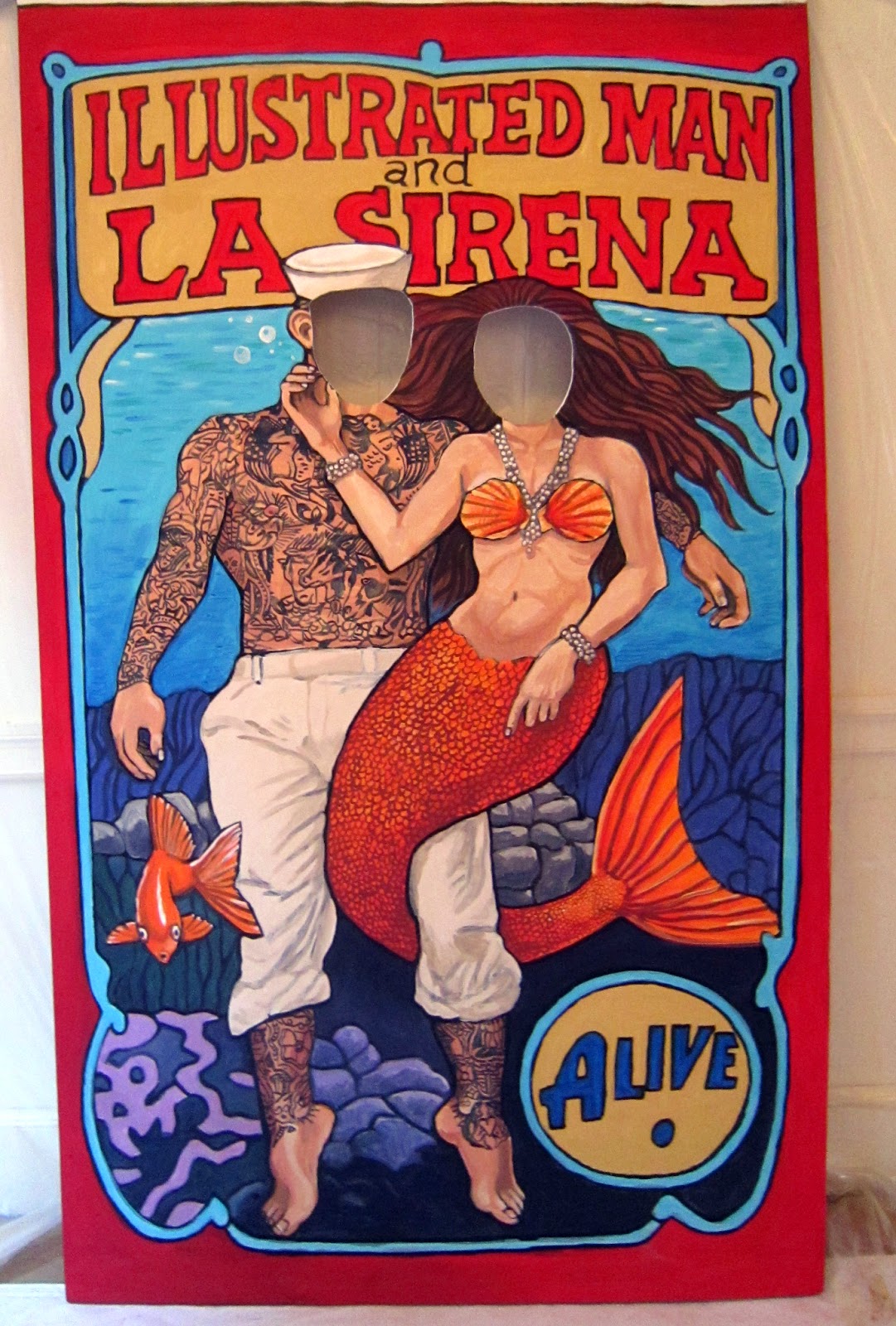
Because time was tight, I was given free reign to come up with the idea. Since I am partial to mermaids, I decided to do a sailor and a mermaid together.
I produced a couple of very quick thumbnail sketches. In one I had the sailor and mermaid on dry land, the sailor standing and the mermaid on a swing.

In another, I had the sailor and the mermaid underwater, with the mermaid's tail wrapped around the sailor's legs. The director liked that one the best, so I refined it a little bit.
I then gathered my reference, and produced a much more finished black and white sketch.


After initial approval for the black and white sketch, I added color in Photoshop, so that the director could see an approximation of what the final board would look like.


The stage manager Marc Ewart and I set up a temporary studio at the Old Town Hall in Salem. We primed a 4'x8' piece of .25" finish plywood with white primer. The plywood was slightly warped, so we screwed a stiffening frame of 1"x3's around the outer edge. The screws would make a hole in the surface of the board, but  since Marc planned on mounting the board to two upright metal poles, it wouldn't be a problem. Once the board was primed and stiffened, I secured the top of it to the wall with duct tape. We then used a Panasonic digital projector to project the sketch onto the board and drew in the outline with a thin bristle brush and black acrylic.
I had done the original sketch with my own measurements in mind. I am 6' 3". We quickly realized that unless we had a stepladder, most people wouldn't be tall enough to reach the openings for the faces. We had to adjust the image somewhat to get it to a height that would work for allowing an average-sized person to put their heads through the opening. We decided that 5' 6" would be a good average height for the faces, and we "squashed" the image somewhat by adjusting the lens on the projector. At the end of the first day, the board looked like this.

I came back the next day and started to add the color.

I worked with liquid acrylic. I  find it much easier to work with than mixing from tubes, however the liquid acrylic being less thick, generally does not cover as well so I needed to make sure that I mixed up a large enough batch (in a coffee cup)  so that I could be reasonably sure I could go over an area at least two times without running out, or remixing. I started to rough in the largest areas of color, going back to add detail, and make sure that the area was well saturated.


Here is the end of the second day's painting. You can see that the holes for the heads have not been cut out yet.


 The third day I went over the colors yet again, adding and refining the details. Marc cut out the holes for the heads using a router, and I sanded and painted the edges.


Here I am painting after the head-holes have been cut out. The final step was adding the tattoos to the sailor. This required mixing up an appropriate tattoo color (dark green and dark purple) and coming up with a convincing pattern of tattoos.


In my search for reference, I came across photos of a man named Captain Elvy. He was tattooed by a tattoo artist named "Sailor George" in 1943. He was the only example I could find of an American sailor, from about the right time period, with full-body tattoos. Working with a fine brush and starting at the shoulder, I worked my way down the figure of the sailor, covering him with tattoos from neck to wrist, and from knee to ankle. The final result looked like this.


I added a few more touch-ups and my part was done. Marc trimmed the top foot off of the board, and painted the back with white primer to meet the fire safety code. He also scruffed it up a bit to make it look beat-up and aged. The show opened on May 1st. Here is a photo of the board at the show with two people in it.