It's been a couple of months since my last post. I haven't been completely idle. Besides several smaller projects such as logos and rack cards, my business partner and I have been working on a proposal for a very large contract job which involves the branding for several scenic byways in western, MA. If we get the job, we will be busy for the next 18 months.
In the meantime I have been experimenting (screwing around) with some of the 10,000+ photographs I have taken over the last 5 years. (digital cameras, boon or curse?) to come up with some interesting artwork. I sometimes will use my digital photos and Photoshop to compose images that I wish to paint or illustrate later. In art school I was trained in the old-school method of making numerous thumbnails for composition, then proceeding to sketches from life or photo reference and then incorporating those into a detailed study before committing the work to final canvas or illustration board. That is a very time-consuming and labor intensive process. I have shortcut that process by going from thumbnails directly to shooting the reference myself and then arranging the separate photographic elements in the final composition in Photoshop.
To my old-school, analog mind, this feels a little bit like cheating. There is something to be said for the longer process, but time = expense, and i just don't have that kind of time. I also justify this in my mind by remembering that artists I admire such as Norman Rockwell extensively used photographic reference in their work, and by the fact that I am taking the reference photos myself, and there is still quite a bit of thinking, re-drawing and artistic decision-making to be done. It is just a new tool for accomplishing the same thing. And I am all for saving time.
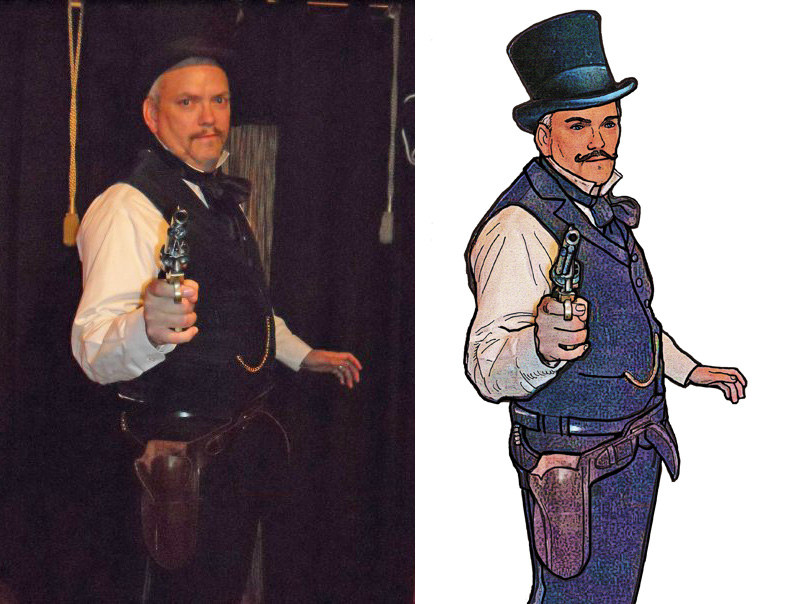
Here is one example. A photo taken of me (with my camera) by a friend at a Christmas party several years ago. (Why am I holding a Colt .45 at a Christmas party? It's a long story, but basically one of our friends had bought it as a gift, and was going from this party to give it to the person he bought it for, and he hadn't gift-wrapped it yet, so he had it with him, and was very excited to show it to everyone. I was dressed as a Victorian for a Dickens Christmas event, and the old-time gun and holster just seemed to go with my outfit, so I seized the opportunity and asked a friend to take my picture).
Although I really like the basic pose, the photo was kind of useless as is as I am wearing mostly black, and photographed against a very dark background. All the detail of my outfit and the top hat get kind of lost. Photoshop to the rescue! First I adjusted the shadows/highlights so that I could delineate between the figure and the background. Then I selected/isolated the figure from the background and deleted the background.
I wasn't happy with the way that the top hat looked in the photo, so I took another photo of the same hat, that had similar lighting and dropped that over the top of my head. Now that the figure was clear of the background, I created a new layer and used the brush tool to trace over/outline the image details in black, enhancing, cleaning and adding to the image as I went.
I ran several Photoshop filters (paint daubs, poster edges, saturation) on the colored background, duplicating the layers and making each one a transparency of 50% to give it a more organic, varied and less-photographic, look. I then combined the layers and flattened the image.
Here is the result. I have used this technique before to "artify" photos.
Although it still feels a bit like cheating, it seems better than just running one artistic filter on the image as is. It gives me the ability to alter details to my liking and still maintain a realistic semi-photographic look. What do you think of the effect?
 |
| Original photo (left) and reworked "artified" image (right) |