It's a lonely life...that of the necromancer, er freelancer

A blog by a designer and illustrator, for designers and illustrators which may contain musings on art, movies and random weirdness.

Monday, May 5, 2014

ICARUS Mugboard

Last year I was invited to do some illustration work for a Cambridge- based theater company called Liars&Believers. They were doing a new production call Icarus, which was loosely based on the Greek legend of Icarus and Daedelus, but was set in the depression-era American midwest of the1930's in a traveling carnival. The company director wanted several large carnival "freak-show" style banners that would refer to characters in the story and act as backdrops for the action. The show ran in Cambridge, and then went to the New York Musical Theater Festival and attracted some notice.

Cut to a year later, and the Liars&Believers company has been invited to re-stage the production at the American Repertory Theater as company-in-residence. The production, which is being performed at the Oberon Theater on Arrow Street, had an opportunity to expand the pre-show show, which consisted of magicians, dancers, sleight-of-hand artists, and other activities to put the audience in the mood for the carnival-style musical production. I was invited by the theater company this year, to create a "mugboard" in the same style as last years banners. A mugboard is one of those things you have probably seen at carnivals or amusement parks hundreds of times, a wooden board that have life-size figures painted on them with cutout heads, so you can stick your face through the hole and have your picture taken, appearing to be that character.

Because time was tight, I was given free reign to come up with the idea. Since I am partial to mermaids, I decided to do a sailor and a mermaid together.
I produced a couple of very quick thumbnail sketches. In one I had the sailor and mermaid on dry land, the sailor standing and the mermaid on a swing.

In another, I had the sailor and the mermaid underwater, with the mermaid's tail wrapped around the sailor's legs. The director liked that one the best, so I refined it a little bit.
I then gathered my reference, and produced a much more finished black and white sketch.


After initial approval for the black and white sketch, I added color in Photoshop, so that the director could see an approximation of what the final board would look like.


The stage manager Marc Ewart and I set up a temporary studio at the Old Town Hall in Salem. We primed a 4'x8' piece of .25" finish plywood with white primer. The plywood was slightly warped, so we screwed a stiffening frame of 1"x3's around the outer edge. The screws would make a hole in the surface of the board, but  since Marc planned on mounting the board to two upright metal poles, it wouldn't be a problem. Once the board was primed and stiffened, I secured the top of it to the wall with duct tape. We then used a Panasonic digital projector to project the sketch onto the board and drew in the outline with a thin bristle brush and black acrylic.
I had done the original sketch with my own measurements in mind. I am 6' 3". We quickly realized that unless we had a stepladder, most people wouldn't be tall enough to reach the openings for the faces. We had to adjust the image somewhat to get it to a height that would work for allowing an average-sized person to put their heads through the opening. We decided that 5' 6" would be a good average height for the faces, and we "squashed" the image somewhat by adjusting the lens on the projector. At the end of the first day, the board looked like this.

I came back the next day and started to add the color.

I worked with liquid acrylic. I  find it much easier to work with than mixing from tubes, however the liquid acrylic being less thick, generally does not cover as well so I needed to make sure that I mixed up a large enough batch (in a coffee cup)  so that I could be reasonably sure I could go over an area at least two times without running out, or remixing. I started to rough in the largest areas of color, going back to add detail, and make sure that the area was well saturated.


Here is the end of the second day's painting. You can see that the holes for the heads have not been cut out yet.


 The third day I went over the colors yet again, adding and refining the details. Marc cut out the holes for the heads using a router, and I sanded and painted the edges.


Here I am painting after the head-holes have been cut out. The final step was adding the tattoos to the sailor. This required mixing up an appropriate tattoo color (dark green and dark purple) and coming up with a convincing pattern of tattoos.


In my search for reference, I came across photos of a man named Captain Elvy. He was tattooed by a tattoo artist named "Sailor George" in 1943. He was the only example I could find of an American sailor, from about the right time period, with full-body tattoos. Working with a fine brush and starting at the shoulder, I worked my way down the figure of the sailor, covering him with tattoos from neck to wrist, and from knee to ankle. The final result looked like this.
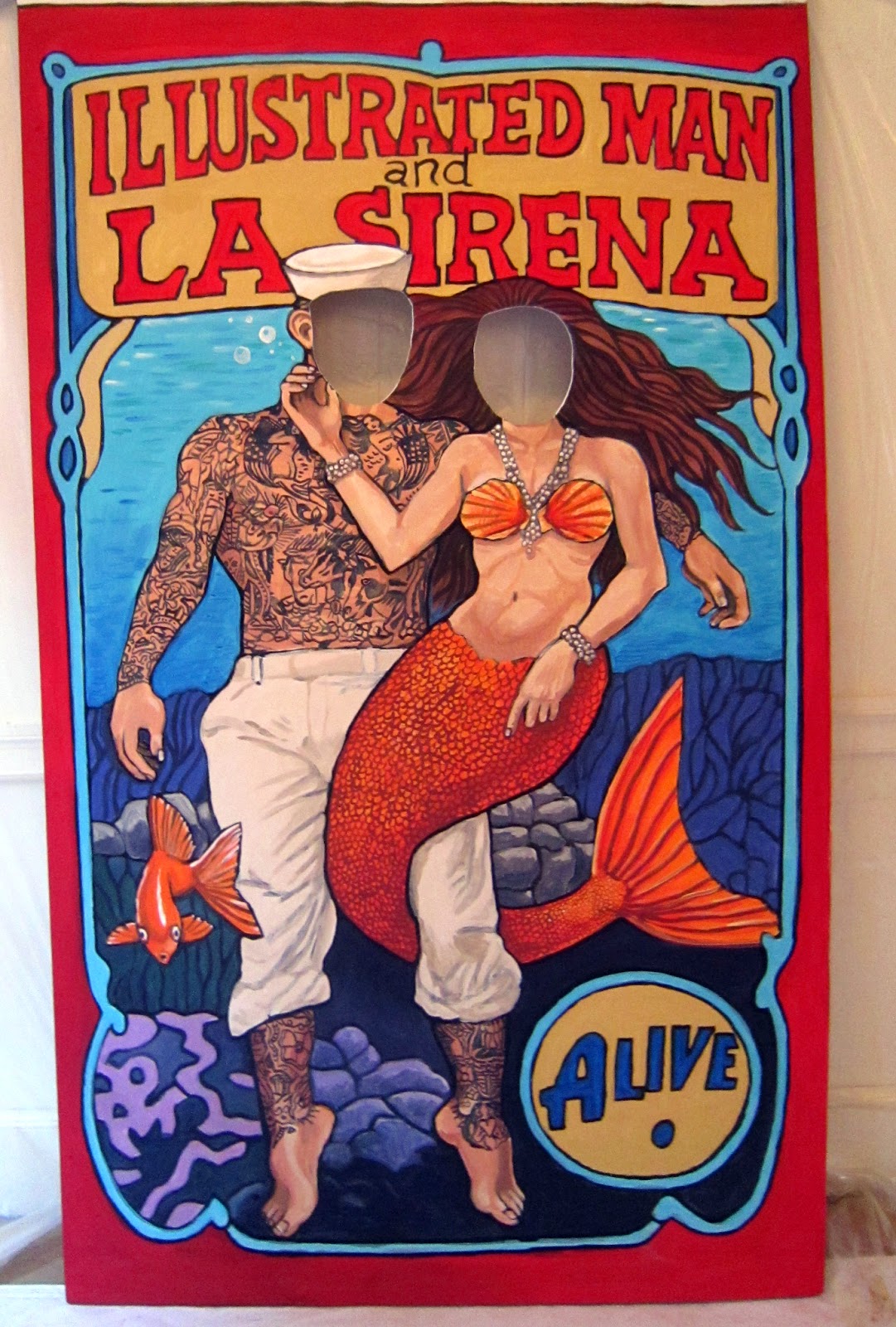


I added a few more touch-ups and my part was done. Marc trimmed the top foot off of the board, and painted the back with white primer to meet the fire safety code. He also scruffed it up a bit to make it look beat-up and aged. The show opened on May 1st. Here is a photo of the board at the show with two people in it.


Thursday, April 24, 2014

Lent Devotional Art


Back in December of 2013, Brynn Harrington, one of the pastors at Highrock Northshore, (the church my wife and I attend), contacted several artists and members of the Art Group at the church about the possibility of illustrating a lent devotional booklet. We all thought it was a very interesting idea. Brynn sent us the 40 days of devotionals, a passage for each day of lent. Kerrie James, one of the Art Group leaders and Brynn, divided up the devotionals among the 6 artists: Solomon Kong, Rachel Neikirk, Kerrie James, Ben Ober, Kirsten Borne, and myself.  I was assigned 7 different passages from day 15 to day 21. My passages were all from the book of Matthew. I took a look at the passages, re-reading them and researching representations of what other artists had done with these specific passages. I wanted the images to be familiar and recognizable, without being cliché. I will focus on the first passage which was Matthew 16:21-28. I decided to focus on verse 24:
24 Jesus then said to his disciples, If any man will follow me, let him forsake himself: and take up his cross, and follow me. 
Most of the images I found were similar to the one below. It is a fairly iconic image, but how to make it my own?
 
We were encouraged to do these in any style and medium we wanted, so that the final variety was visually rich and varied. Because the final illustrations in the devotional book were going to be small , (about 2 inches square), and also because I procrastinated on the project until the week before the deadline, I decided to do mine as small, very loose colored-pencil drawings. I wanted them to be as direct and simple as I could make them. I drew them all on one sheet of Bristol board at about a 1 inch by 1 inch size. I sketched in non-photo blue pencil and then inked and colored them with colored pencil.


As you can see from this detai, they are pretty rough.


I scanned the images individually so that they were 300 ppi at 3.5 inches, or about twice the size they would be when finished. I liked the texture and the energy of the sketches, but I also realized that they would need to be refined a bit for reproduction, so I brought the scans into Photoshop, and started to digital "clean-up". In most cases I was deleting the sketch lines, and saturating the color. Sometimes redrawing or clarifying parts of the image, (such as the face). The trick was to clean it up without going too far and losing the gesture and energy of the original sketch. Here is the final version of "Take up your cross".


Here are the final versions of all the artwork. You can see that they  have achieved various levels of success. The least successful is probably #2 "The Transfiguration"and the most,  #7 "the Greatest Commandment", but overall, i was pretty happy with the results.


 The final digital files were sent off to the church office to be placed into the book design.
This is what the illustration looked like printed.


The artwork was also projected as a background image for the  Good Friday service, and prints of the artwork were displayed at the Easter service.

Wednesday, April 2, 2014

Essex National Heritage Folder and Stationary

After working on this project off-and-on for over a year, the new pocket folder for the Essex National Heritage Commission has finally released and printed. The design work itself did not take that long, but the revisions and the approval process was long and involved. Final selection of photos that would be representative of all aspects of the Essex National Heritage Area  took the longest. I am very happy to have finally completed the work!


front of folder


 inside of folder


3 versions of the stationary

Tuesday, March 18, 2014

Jennifer Evans: The Last Cheap Hotel Promotional Package


I have been working for the last several months through New Arts Collaborative on a promotional package for folk singer Jennifer Evans. This included updating the look of her website and designing the cover for her new CD, “The Last Cheap Hotel.”
Evans’ elegant mezzo, her insightful phrasing and her warm connection with audiences make her a spellbinding performer and balladeer. The stories she tells with song — some of the most memorable composed by her brother Griff —  deliver us into the throes of joy, love, loss, remembrance and hope. The design of the materials was determined partly by the singer's personal preferences, but also by the mood and social conscience of the music. 

The first thing was to develop a mood board. One of Jennifer's music heroes and influences was folksinger Woody Guthrie. This seemed to call for a visual style that would capture something of the period in which he was singing, 1930's depression-era Americana. I started looking at a lot of depression-era artwork including Edward Hopper, to try to come up with a look and feel for the package. I developed some "theme boards" comprised of images from that period.
Working with Jennifer,  New Arts Collaborsative principal Rae Francoeur and photographer Kathy Tarantola scouted locations on the north shore and tried to pin down a wardrobe for the shoot. They eventually found a large Victorian house to serve as a backdrop/setting in Jennifer's hometown of Danvers. Although not a "cheap hotel" it had the proper kind of run-down gentility that we were looking for.


They tried numerous poses, and several different outfits before we all agreed on one that we liked.
Once the main images and style were set, I began designing the CD packaging.  We decided to go with Oasis Disc Manufacturing http://www.oasiscd.com as the vendor, and after exploring several options for packaging, decided to use one of their environmentally-friendly CD-UD100 digipaks.
This went through many many rounds of changes and revisions on image, type and configuration until we arrived at this design for the CD package.


 This is the front and back cover layout, and a sample spread for the 16-page insert booklet.


We decided to go with a solid-color design for the CD itself.

Once the CD print packaging was completed, the next step was to redesign Jennifer's website to more closely reflect the new album . This is the homepage for the old website. It was perfectly functional, but had not been updated in several years.


Using iWeb and some third-party applications for customization, I developed a design for a new, quick, inexpensive and easy-to-maintain, 6-page website that would include links to social media, sites where you could listen to and purchase the music, download the lyrics and press photos, and generally reflect the new branding of the CD packaging.  Below are three sample pages from the new site. http://jennifer-evans.com
As of this posting it is still being updated, and revised.


In addition to the CD packaging, as we approached the actual release of the album, I designed and produced a number of other print collateral pieces that were either sent to Radio stations and promoters, were included with the CD at performances, or appeared as PDFs on the website for download.
These included a Q&A document:


A description of the tracks on the album.


A press release.


A lyric sheet.


Wednesday, March 12, 2014

Artspeak: Awaken Promotional Materials


Besides helping to plan, organize and set up the recent Artspeak:AWAKEN art show, concert and auction, and painting two entries for submission, I also designed all of the promotional materials including a 13" x 19" poster, an 8.5" x 11" flyer, and a 4" x 6" postcard.

Friday, February 28, 2014

ARTSPEAK!:AWAKEN Painting Number 2

After finishing my Artspeak entry number 01, "The Universe Awakens", I decided I would try to do another painting. This one is much larger and more ambitious.
My plan was to paint a painting based on a photo that I had snapped of my wife Amy shortly after we had moved into our condo. She had arisen one morning in her night gown and had gone to the window to look out at something. I saw her there framed in the window, and the light was very nice, so I grabbed my camera and took a quick shot. It was very spur of the moment.

Cut to 6 years later. I am rummaging around in my file folder of images I have wishfully named "Painting Ideas" (images I think would make nice paintings someday). This one is in it.


It occurs to me that this might be an image that would fit the Artspeak "Awaken"theme.

There were two blank 48" x 60" canvases at the church office, which belonged to my friend Kirsten. Since she is a young mother with 3 children and a job, and it was unlikely that she would be using either canvas anytime soon, and she graciously donated one of them to me.

This is the first time I have tried a painting quite this large in quite a long time.
First order of business was re-priming the canvas with several coats of gesso so that it was clean, and tight on the frame.
Next I printed out the photo on a piece of 8.5" x 11" paper and drew a grid of horizontal and vertical lines about 1 inch apart. I then calculated the size they would be on the large canvas and drew a corresponding grid on the canvas using a yardstick and a graphite stick. Then I sketched a cartoon of the image using the grid as my visual guide. Once I got that sketched in graphite, I started painting, roughing in the light and dark areas using white and black acrylic, to create some underlying tone.


Next I took some burnt sienna and started redrawing the details of the figure and background.


Then I started adding in some touches of color. Layering it in, in thinner, very liquid washes.


Then it was adding in the details, working from broader to finer areas.


Here is the palette, (an enameled meat tray)


In some cases, painting over the same areas multiple times. After about 3 full days worth of work this is where I am at. I am hoping to finish this up before the submission deadline of Tuesday, March 4.


Latest work, as of Thursday, March 7th. Looks like I will be working on this up until the last possible second!


Well, here it is, the final signed painting. Worked on until about 4:30 Friday.
Probably about 40 hours worth of work. I decided to title it simply "At the Window".