It's a lonely life...that of the necromancer, er freelancer

A blog by a designer and illustrator, for designers and illustrators which may contain musings on art, movies and random weirdness.
Showing posts with label Salem Theatre Company. Show all posts

Monday, July 21, 2014

The New Salem Theatre Brochure

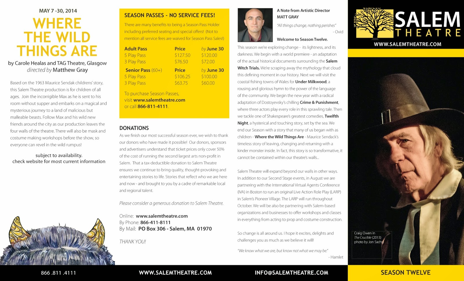
The latest brochure for the 12th Season of the Salem Theatre (formerly known as the STC). The hot-off-the-presses brochure includes the new logo and branding and some very fun show identity illustrations by artist Heather Reid. This is my third brochure for the Salem-based company, and my first for the new Artistic Director Matthew Gray, and new Managing Director Kate Ventimiglia.


Wednesday, June 18, 2014

New Salem Theatre Logo

One of my regular clients for the past 5 years has been the Salem Theatre Company http://www.salemtheatre.com/. I was first brought into the company by Executive Director Gary LaParl, whom I had met when I was a member of the Salem Arts Association and Matteo Pangallo, the original founder of the company, and a co-worker at the Peabody Essex Museum. They brought me in to design a print brochure (the first) for the milestone sixth season and develop a branding system for their promotional materials.

The Salem Theatre Company (STC) was founded in 2002 by Artistic Director, Matteo Pangallo. To implement his vision of a semi-professional local theater for Salem and the North Shore, he established a Board of Directors (BOD) and a Board of Advisors (BOA), and led the first several seasons. During his tenure, and under the original BOD, STC was incorporated as 501(c)(3 ) Salem Arts Center, Inc.

Matteo had designed the original STC logo, unfortunately it was created in Microsoft Word, and had very limited applicability. It looked like this:


The print materials for the first few seasons were sometimes striking, but were also uneven in execution. There was no STC "look". One of my jobs was to refine the existing logo, create a standard framework for the posters, business cards, postcards, ads, signage and other materials for the theatre, all on a very tight, non-profit budget.

I streamlined the STC logo, and recreated it as a vector-based graphic, selected a color palette, and set up a template for show posters, event posters, and the season brochure. I also developed identities for the shows in the Season 6 and the Season 7 brochures. Here is the revised logo:


When John Fogle became artistic director of the STC in 2009, he took over developing the show identities. (He had an extensive background in photography and design). I continued to produce the show posters and special event posters. That continued until this year, when John stepped down as artistic director. A new artistic director, Matthew Gray, was appointed in the spring of 2014. He brought a tremendous amount of energy and new ideas to the Salem Theatre and immediately went in a new direction, including completely revamping the existing logo.

Apparently on Matthew's first visit to Salem with his wife Kelly, they had visited one of the old cemeteries that crowd the center of Salem. The trees there are particularly old and impressive. This struck Matthew as a powerful symbol, not only of Salem, but also what he wanted the theatre to be and stand for. An active and inter-active part of the community.


Matthew and Gary LaParl, had developed a prototype of what they wanted:


Although I liked the look of it. I saw some immediate problems. The tree component had been grabbed from  a website and was not available for licensing. Also, there was no tie-in with the existing logo's colors or typefaces. Complicating the identity was the fact that they had decided to drop "company" from the logo.The Salem Theatre Company (STC) would be henceforth known as simply as the Salem Theatre.Matthew


Once again, there was a good-looking logo that was basically unusable. My job became creating a version of this logo idea that was workable, legal, and bridged the jump from the old logo to the new.
First I had to find the right tree. I actually maintain a file of tree photos called "Sexy Trees". I like trees and find them to be visually fascinating. Using one of my tree photos as reference, I redrew the existing tree by hand. It needed to be similar to the one in the prototype, without being a copy.
I came up with this:


Although still somewhat stylized, it was less symmetrical and therefore a bit more realistic. Matthew and Gary had already selected Trebuchet as one of the typefaces for the new logo. In order to make some connection with the old system, I used Myriad Pro Regular for the "Salem" face. I also used the original "STC yellow" (Pantone122) as the background color. I developed both a vertically-oriented and horizontally-oriented version of the logo.


After review, Gary and Matthew both wanted a version of the logo where the tree branches broke the border of the frame. So I made a version with the tree inside the box was one object, and the branches outside the box were another. That way if the logo appears on a black background, the extending branches would stand out.


The new logo was approved and is currently being rolled out on various materials including a 12th Season brochure, but more about that later.

Friday, January 4, 2013

STC Shining City Poster


The latest poster for the Salem Theatre Company production of Shining City. After the initial version of the poster was produced, there was a last-minute cast change, so I produced a revised version.


Friday, November 16, 2012

STC RECKLESS POSTER


A poster for the STC production of "Reckless".
The original artwork was lost, so I had to
reconstruct the artwork from 6 different pieces of art.

Saturday, September 8, 2012

Thursday, May 31, 2012

Recent Work - Spring 2012

I haven't posted since April. One might think I was slacking, but I have been pretty busy with projects, as well as maintaining 6 blogs and several websites. I am also working on a logo for a new, Boston-area theatre company, developing ads for a well-known local music venue, and starting a very large logo/branding project.
Here is some recent print poster work for the STC Salem Theatre Company  and a rack card for the Essex National Heritage Commission for the Essex Coastal Scenic Byway project.


A PICASSO was so popular, the original run of the play was extended by several weeks. This is the extended run version of the poster.


Wednesday, November 9, 2011

Recent Work for the Salem Theatre Company

Here are some recent posters I have done for the STC during October and November.
Salem theater is busy this time of year!


Wednesday, January 5, 2011

Some Recent Work for STC

One of my regular clients is the Salem Theatre Company. I have been producing various print pieces including large display posters, show identities, and signage for the last 3 years. Here is some of my recent work for them.


Friday, January 29, 2010

STC-Later Life- FINAL

Back again. Round 3. After showing the color sketches to the director, he felt that the image was a little too realistic, and as a result had lost some of it's sketchy charm. I had to agree with him. This sometimes happens when you work and rework an image. It gets more detailed and refined, but it also loses some of its energy. The word used was to describe the last round was "clinical". Not what you hope for. So now I have the challenge of pulling back and loosening up the image. The director also felt that he wanted to punch up the humor a bit as the title and the subject matter could lead people to think it could be a bit of a drag. So I also need to "up" the comic eccentricity of the image without losing the romance, or messing up the basic composition. I find that when I get to this point I need to get into a more left-brain kind of mood. Since I have a tendency to gravitate towards careful rendering, I can achieve this by physically warming up, working fast and in a medium that is loose by nature, i.e. paint, as opposed to pen and ink, brush as opposed to pen. It also helps if I have a little bit of wine...


Here is my initial attempt to rework the image in a looser, more cartoony style.


Here is the finished, or I should say, almost finished final artwork. We'll see how the client likes it before I say it is completely finished.


Well, the client ultimately did not like the final artwork, and decided to shoot their own photography to illustrate the play. Although disappointing, it's OK, as I will still be designing the final poster using their image, and I got paid. I still think that the original version (before the addition of the cartoon-ey foreground figures) worked well. Oh well, no one said illustration was easy. For myself, I painted the foreground figures out of the final painting, re-scanned it, and cropped the final image. (This was my favorite part of the image anyway). Here is the final result.

Friday, January 15, 2010

STC LATER LIFE Poster-UPDATE

I am currently doing some work for the Salem Theatre Company. One of the projects is the development of a graphic image for A.R. Gurney's play LATER LIFE.
The play deals with upscale, wasp-ish characters who have a second chance at a missed romance.
LATER LIFE is set in the early 1990s, on the terrace of a high-rise apartment building overlooking Boston Harbor and takes place on an early September evening. The two main characters are a middle-aged couple named Austin and Ruth who have an opportunity to get re-acquainted at a cocktail party given by a mutual friend (Sally); They had met long ago, in Capri, but Austin had not risked pursuing a romance with Ruth, as he harbors a secret fear that something terrible is going to happen to him. As they meet again, Austin has led a life perpetually "on hold" avoiding risks, but avoiding opportunities as well, and Ruth is stuck in an unhappy marriage. They attempt to rekindle their aborted romance but are interrupted throughout the evening by Sally and assorted guests who wander out onto the terrace.

The director expressed a desire that the feeling of the graphic should be sophisticated, and charming, reminiscent of a New Yorker cover. The focus on the couple, not on the secondary characters, or the setting, and he wanted to convey both the longing of the characters for a second chance, and the tentative manner of Austin. I did a quick thumbnail of the image he was talking about.


I did some research, and assembled some images of balconies, Boston Harbor, Nineties fashion, and middle-aged couples. I also looked at New Yorker covers both online and in a book called Covering The New Yorker: Cutting-Edge Covers From A Literary Institution.

I worked up some simple black and white line drawings containing the basic elements that needed to be present, the couple, a balcony and some indication of the Boston harbor and skyline.

I didn't need to be too literal with the interpretation. You rarely have the actors cast before the image must be completed, so capturing a general feeling is better than specific details, although I did toy with the idea of including images of historic disasters, to convey Austin's underlying fear of impending doom.

Here are the first sketches:


I was trying to capture a mood, mostly through the body language of the two characters.
I was also trying out some type treatments, and orientations. Although vertical works best for most print, poster/flyer combinations, a horizontal orientation seems to work best for the web. I wanted to see if one image could be adapted to both orientations.
Then there was the question of style. There were so many to choose from in the case of the New Yorker, everything from the loose sketchy style of Edward Sorel, the whimsy of Peter de Séve, the crosshatching line of R. Crumb, to the stylized painterly realism of Owen Smith, and everything in-between. I decided that the loose sketchy style of Edward Sorel, who did many New Yorker covers in the mid-nineties, would be best for this particular subject matter. This leads to the second set of sketches.


As you can see I have infused some feeling and style into the sketches, refining the couple's body language and adding some color. I have also added in the typeface (AT Handle Oldstyle)which is very similar in look to the New Yorker font. This is where I am currently in the process. I will post more as I refine the sketches into the finished graphic/illustration.


Well I'm back for the next step. The initial sketch was approved, so I gathered together my photo reference. My wife loves vintage clothing, and happened to have a lovely 90's-era dress that she was kind enough to model for me, and I still own a sportcoat from the 90's, so we dressed up and shot pictures of each other in the basic poses that I was looking for using a digital camera. These two images were taken in our kitchen.


I then used these images, as well as other reference for furniture, rugs, wine glasses, etc. to do the final black and white line drawing.


The next thing to do, was to work out the final colors in a marker sketch.


This is the last step before I transfer the image to illustration board and create the final, final version of the artwork.
Monday, November 30, 2009

Character Sketches


Here are some character sketches for a children's book I have been working on, "Piewacket, Ship's Cat of Salem". My wife Amy wrote the story, and she has been trying to get me to illustrate it for months. The story is about a ship's cat on board the Friendship, an early 19th century merchant ship that sailed from Salem, to Sumatra and other ports of call in southeast Asia, to trade for pepper and other spices. It was not uncommon for ships to have a ship's cat, in order to keep the rats and mice from eating or destroying the cargo. The cat in the story is based on our own cat Piewacket, who is a very large Russian Gray. The story is finished, but the artwork is definitely a work-in-progress. The top sketch is of the two main characters, Piwacket the cat, and Thomas, the cabin boy. Below are sketches for the Captain, a ship's rat, the Farmer, who brings the cat to the Friendship, and the First Mate.

Tuesday, November 24, 2009

Naughty and Nice


Here is a poster I just completed for the Salem Theatre Company. It is for their Christmas Repertory show, Dylan Thomas' "A Child's Christmas in Wales" (NICE) and "The Eight:The Reindeer Monologues" (NAUGHTY). The challenge was to come up with an attention-getting poster/image that would represent both shows without being offensive,
or misleading. Since everyone I know is having a difficult time financially this year, I thought that the lump of coal in the stocking image was appropriate. I just wish I had put "AIG" or "Wall Street" on the stocking.