Last year I was invited to do some illustration work for a Cambridge- based theater company called Liars&Believers. They were doing a new production call Icarus, which was loosely based on the Greek legend of Icarus and Daedelus, but was set in the depression-era American midwest of the1930's in a traveling carnival. The company director wanted several large carnival "freak-show" style banners that would refer to characters in the story and act as backdrops for the action. The show ran in Cambridge, and then went to the New York Musical Theater Festival and attracted some notice.
Cut to a year later, and the Liars&Believers company has been invited to re-stage the production at the American Repertory Theater as company-in-residence. The production, which is being performed at the Oberon Theater on Arrow Street, had an opportunity to expand the pre-show show, which consisted of magicians, dancers, sleight-of-hand artists, and other activities to put the audience in the mood for the carnival-style musical production. I was invited by the theater company this year, to create a "mugboard" in the same style as last years banners. A mugboard is one of those things you have probably seen at carnivals or amusement parks hundreds of times, a wooden board that have life-size figures painted on them with cutout heads, so you can stick your face through the hole and have your picture taken, appearing to be that character.
Because time was tight, I was given free reign to come up with the idea. Since I am partial to mermaids, I decided to do a sailor and a mermaid together.
I produced a couple of very quick thumbnail sketches. In one I had the sailor and mermaid on dry land, the sailor standing and the mermaid on a swing.

In another, I had the sailor and the mermaid underwater, with the mermaid's tail wrapped around the sailor's legs. The director liked that one the best, so I refined it a little bit.


After initial approval for the black and white sketch, I added color in Photoshop, so that the director could see an approximation of what the final board would look like.

The stage manager Marc Ewart and I set up a temporary studio at the Old Town Hall in Salem. We primed a 4'x8' piece of .25" finish plywood with white primer. The plywood was slightly warped, so we screwed a stiffening frame of 1"x3's around the outer edge. The screws would make a hole in the surface of the board, but since Marc planned on mounting the board to two upright metal poles, it wouldn't be a problem. Once the board was primed and stiffened, I secured the top of it to the wall with duct tape. We then used a Panasonic digital projector to project the sketch onto the board and drew in the outline with a thin bristle brush and black acrylic.
I had done the original sketch with my own measurements in mind. I am 6' 3". We quickly realized that unless we had a stepladder, most people wouldn't be tall enough to reach the openings for the faces. We had to adjust the image somewhat to get it to a height that would work for allowing an average-sized person to put their heads through the opening. We decided that 5' 6" would be a good average height for the faces, and we "squashed" the image somewhat by adjusting the lens on the projector. At the end of the first day, the board looked like this.

I came back the next day and started to add the color.

I worked with liquid acrylic. I find it much easier to work with than mixing from tubes, however the liquid acrylic being less thick, generally does not cover as well so I needed to make sure that I mixed up a large enough batch (in a coffee cup) so that I could be reasonably sure I could go over an area at least two times without running out, or remixing. I started to rough in the largest areas of color, going back to add detail, and make sure that the area was well saturated.

Here is the end of the second day's painting. You can see that the holes for the heads have not been cut out yet.


The third day I went over the colors yet again, adding and refining the details. Marc cut out the holes for the heads using a router, and I sanded and painted the edges.

Here I am painting after the head-holes have been cut out. The final step was adding the tattoos to the sailor. This required mixing up an appropriate tattoo color (dark green and dark purple) and coming up with a convincing pattern of tattoos.

In my search for reference, I came across photos of a man named Captain Elvy. He was tattooed by a tattoo artist named "Sailor George" in 1943. He was the only example I could find of an American sailor, from about the right time period, with full-body tattoos. Working with a fine brush and starting at the shoulder, I worked my way down the figure of the sailor, covering him with tattoos from neck to wrist, and from knee to ankle. The final result looked like this.
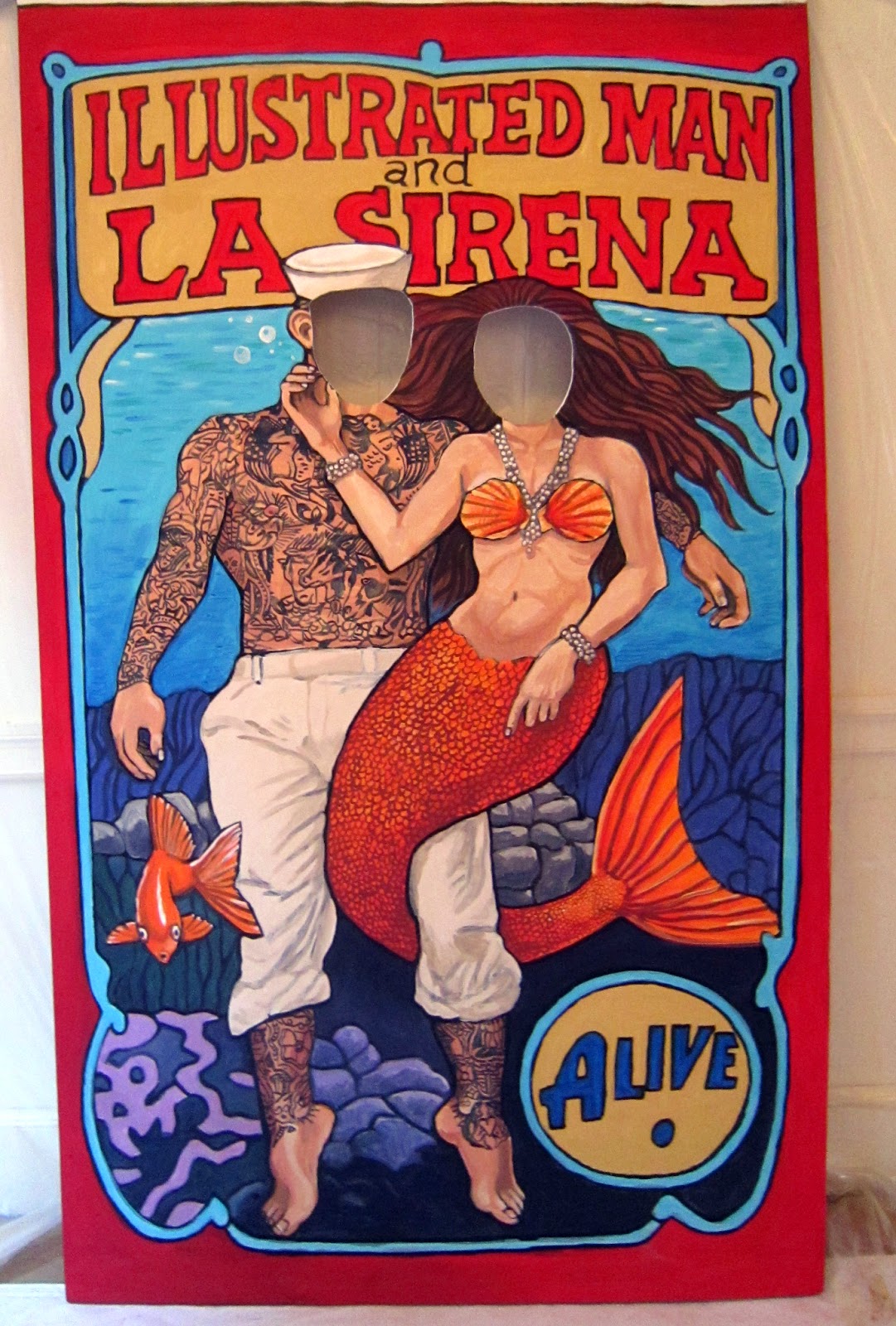
I added a few more touch-ups and my part was done. Marc trimmed the top foot off of the board, and painted the back with white primer to meet the fire safety code. He also scruffed it up a bit to make it look beat-up and aged. The show opened on May 1st. Here is a photo of the board at the show with two people in it.