It's a lonely life...that of the necromancer, er freelancer

A blog by a designer and illustrator, for designers and illustrators which may contain musings on art, movies and random weirdness.
Showing posts with label Mermaid. Show all posts

Monday, July 6, 2020

Neptune & Salacia - Old Salt and Mermaid


A quick sketch comparing the mythological figures of the Roman god Neptune and his wife the goddess Salacia, with a more contemporary version of an old salt sea captain, and a mermaid.


Wednesday, September 16, 2015

Summer Work: Grave Dancing

I recently attended an intimate dinner theater event, where a friend of mine, Andrew Borne, read some of his poetry. He wrote this poem after reading a lot of Charles Simic’s poems. Simic writes in a very surreal but simple way and he wanted to do something similar. His poem is about finding flowers blooming in everyday events or experiences. Here is the poem:

Blooms have been coming up everywhere

A bed of tulips is rising from the spokes of my bicycle

A field of clovers is emerging from the roof top of my apartment

Several water lilies sit between the bubbles in the baby’s bath water

The hair of my 3 children has turned to pear blossoms


The petals fly from their heads like snow

As they dance in the wind

The backyard grill has sprouted a lilac bush


The aroma has taken over the entire neighborhood

The lavender clusters cover the hot coals

A father’s coffin is pushed open from the force


Of a large magnolia tree in full bloom

As the mourner’s hearts erupt with sorrow, joy

A cross on Golgotha has grown rose buds


The first one is opening from the soldier’s spear wound

The Convict relinquishes His Spirit, a new fruit

The imagery spoke of life growing from unexpected places, including the grave, and one passage really inspired me;
A father’s coffin is pushed open from the force


Of a large magnolia tree in full bloom


A corpse being animated by the roots of a tree. That inspired this pen and ink and watercolor drawing.
I call it "Grave Dance".


That got me to thinking and more drawing. I wanted to do something a little cleaner-looking with two figures who were more obviously dancing. "Grave-Dancing". This one is pen and ink colored digitally in Photoshop.


This led to a general obsession with the juxtaposition of skeletons and life. This next one is called "Crown of Ivy".
Another pen and ink and watercolor.


The next one is a variation on the theme called "Flames of Love". The idea of love totally consuming two people till there is nothing left but the bones. Pen and ink and acrylic.


Then the skeleton-couple idea kicked in. This one came to me as I was lying in bed my wife and our cat one morning. "Skeletal Couple and Cat"


This led to different types of couples. The idea of a human man and a mermaid. "Man and Mermaid".


This led to a final mermaid/man composition, a variation on the skeleton/mermaid idea I called "Tideline".


This one is called "Heartflower".
 

Friday, April 24, 2015

NESCBWI - Illustration Challenge

My wife Amy and I are attending the Society of Children's Book Writer's and Illustrators New England conference in Springfield, MA this April. I just joined SCBWI this year and this will be my first conference as a member. I have worked as a graphic designer for almost exactly 30 years, and although it pays the bills (mostly) my first love has always been illustration. To that end, I am trying to jump into the illustration field.
In keeping with the conference theme, "Think Outside the Crayon Box!", and to "get your creative juices working" SCBWI holds an illustration challenge. Your artwork is displayed at the conference all day Saturday for everyone to see. It is a great portfolio building exercise and a wonderful
promotional opportunity. The Challenge for this year was:
We would like you to illustrate this single line of text for a double-page spread of a picture
book: “Don’t worry–I fixed it.” Interpret in any way you like.
So first, I did some thumbnail sketches.


I like to work small, really small. These sketches are all about 3" x 2". I drew them in pencil and then colored them with ink and watercolor. I did (8) sketches total. I showed the sketches to my illustration critique group. They felt that some ideas were not appropriate for a children's book, and some were not that clear. The two they liked the most were the "Alien Garage" (upper left hand corner) and the "Mermaid Patching Job" (right hand top), but they had suggestions for changes on both of them.
"Alien Garage" shows an large orange alien mechanic finishing up repairs on a flying saucer belonging to a young girl astronaut, and her blue-skinned companion. The repairs have not gone well, and the saucer is definitely not space-worthy despite the alien's assurances.
Some issues pointed out for Alien Garage: it lacked context. Where was it located? What made it alien? Also; the body language of the children was not clear. What were they feeling?
"Mermaid Patching Job", shows a mermaid just finished repairing a hole in a rowboat that has struck a submerged rock, by covering it with a large starfish, and giving the "OK" sign to the little girl in the boat, while her father examines the strange patch. Issues with Mermaid Patching Job were mostly with it not being clear what the mermaid is doing. Is she finished patching the hole or is she assisting the "captain" figure with the patching? They wanted to see more context, more obvious damage to the boat, more clues as to what had happened. They also wanted the mermaids head farther out of the water, and her hair to cover her "side-boob".
I couldn't choose between the two until I had done some more work on them. So I took the two selections and reworked them.


First of all, now that I had two fairly solid ideas, I would need to rework them to the proportion of the final specifications, which was 10" x 16", the equivalent of a 2-page spread. Since at this point I was leaning heavily towards the mermaid idea, I extended the mermaid in watercolor, but only did the alien garage digitally.


I showed my group the revisions. They thought they were an improvement, but still thought they both needed additional work. Especially the mermaid. I did further sketches/revisions.


I changed the position of the "captain" figure, and adjusted the position of the mermaid so that her head was farther out of the water, and her hair was covering her upper torso. I added broken pieces of the boat to the water, and made the starfish "patch" larger and brighter. Although I liked it, I decided I liked the alien garage better.
I started to work on the finished piece. I added a lot more detail to let the viewer know that the spaceship was having issues. More broken wires, leaks, sparks flashing, essential-looking components strewn about. I had done sketches of various spacecraft components to populate the area around the ship.


Here is the final pencil sketch on Bristol board with all of the major elements in place.


I then started laying in the values using Payne's Gray acrylic paint.


Finally I started adding the color. Here is the color version of the painting.


I scanned the final illustration, did a bit of touch-up and color adjustment in Photoshop, brought it into InDesign and set the text. Here is the version that will be on display at the conference.


Monday, May 5, 2014

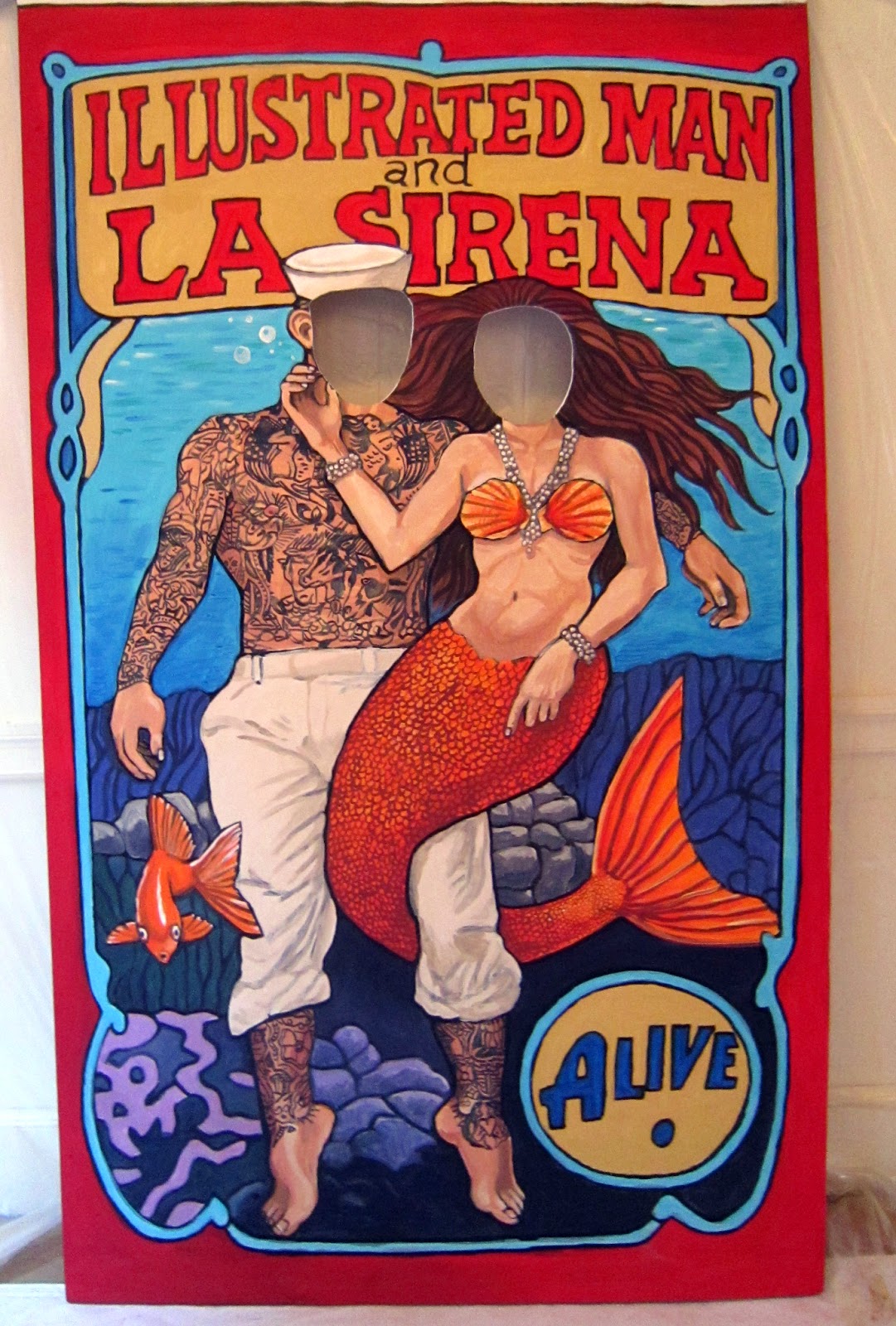
ICARUS Mugboard

Last year I was invited to do some illustration work for a Cambridge- based theater company called Liars&Believers. They were doing a new production call Icarus, which was loosely based on the Greek legend of Icarus and Daedelus, but was set in the depression-era American midwest of the1930's in a traveling carnival. The company director wanted several large carnival "freak-show" style banners that would refer to characters in the story and act as backdrops for the action. The show ran in Cambridge, and then went to the New York Musical Theater Festival and attracted some notice.

Cut to a year later, and the Liars&Believers company has been invited to re-stage the production at the American Repertory Theater as company-in-residence. The production, which is being performed at the Oberon Theater on Arrow Street, had an opportunity to expand the pre-show show, which consisted of magicians, dancers, sleight-of-hand artists, and other activities to put the audience in the mood for the carnival-style musical production. I was invited by the theater company this year, to create a "mugboard" in the same style as last years banners. A mugboard is one of those things you have probably seen at carnivals or amusement parks hundreds of times, a wooden board that have life-size figures painted on them with cutout heads, so you can stick your face through the hole and have your picture taken, appearing to be that character.

Because time was tight, I was given free reign to come up with the idea. Since I am partial to mermaids, I decided to do a sailor and a mermaid together.
I produced a couple of very quick thumbnail sketches. In one I had the sailor and mermaid on dry land, the sailor standing and the mermaid on a swing.

In another, I had the sailor and the mermaid underwater, with the mermaid's tail wrapped around the sailor's legs. The director liked that one the best, so I refined it a little bit.
I then gathered my reference, and produced a much more finished black and white sketch.


After initial approval for the black and white sketch, I added color in Photoshop, so that the director could see an approximation of what the final board would look like.


The stage manager Marc Ewart and I set up a temporary studio at the Old Town Hall in Salem. We primed a 4'x8' piece of .25" finish plywood with white primer. The plywood was slightly warped, so we screwed a stiffening frame of 1"x3's around the outer edge. The screws would make a hole in the surface of the board, but  since Marc planned on mounting the board to two upright metal poles, it wouldn't be a problem. Once the board was primed and stiffened, I secured the top of it to the wall with duct tape. We then used a Panasonic digital projector to project the sketch onto the board and drew in the outline with a thin bristle brush and black acrylic.
I had done the original sketch with my own measurements in mind. I am 6' 3". We quickly realized that unless we had a stepladder, most people wouldn't be tall enough to reach the openings for the faces. We had to adjust the image somewhat to get it to a height that would work for allowing an average-sized person to put their heads through the opening. We decided that 5' 6" would be a good average height for the faces, and we "squashed" the image somewhat by adjusting the lens on the projector. At the end of the first day, the board looked like this.

I came back the next day and started to add the color.

I worked with liquid acrylic. I  find it much easier to work with than mixing from tubes, however the liquid acrylic being less thick, generally does not cover as well so I needed to make sure that I mixed up a large enough batch (in a coffee cup)  so that I could be reasonably sure I could go over an area at least two times without running out, or remixing. I started to rough in the largest areas of color, going back to add detail, and make sure that the area was well saturated.


Here is the end of the second day's painting. You can see that the holes for the heads have not been cut out yet.


 The third day I went over the colors yet again, adding and refining the details. Marc cut out the holes for the heads using a router, and I sanded and painted the edges.


Here I am painting after the head-holes have been cut out. The final step was adding the tattoos to the sailor. This required mixing up an appropriate tattoo color (dark green and dark purple) and coming up with a convincing pattern of tattoos.


In my search for reference, I came across photos of a man named Captain Elvy. He was tattooed by a tattoo artist named "Sailor George" in 1943. He was the only example I could find of an American sailor, from about the right time period, with full-body tattoos. Working with a fine brush and starting at the shoulder, I worked my way down the figure of the sailor, covering him with tattoos from neck to wrist, and from knee to ankle. The final result looked like this.


I added a few more touch-ups and my part was done. Marc trimmed the top foot off of the board, and painted the back with white primer to meet the fire safety code. He also scruffed it up a bit to make it look beat-up and aged. The show opened on May 1st. Here is a photo of the board at the show with two people in it.