It's a lonely life...that of the necromancer, er freelancer

A blog by a designer and illustrator, for designers and illustrators which may contain musings on art, movies and random weirdness.

Monday, October 21, 2013

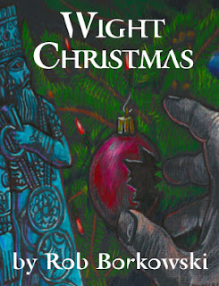
Wight Christmas Illustration

A friend of mine, Rob Borkowski, is a newspaper reporter and an aspiring fiction writer. He contacted me a few weeks ago wanting an illustration for an e-book he wanted to post to Amazon. It was also his debut as an author, so he wanted to make a good first impression.

His plan was to do this for about four or five short stories, then publish an omibus/anthology, but this was to be the first one. He also had a very small budget. (No pressure or anything)

Rob sent me the manuscript and I read it. It was short, easy read, only a page and a half long, and concerned a young man, who in the course of dismantling his roommate's Christmas decorations, runs afoul of an ancient Mesopotamian god named Marduk.

At first I assumed that the god's name and connection to Christmas was solely a product of Rob's fertile imagination, but in starting the research for the illustration, I discovered that the god Marduk and the associated festival of Zagmuk, has a long association with the Christmas and especially the Medieval concept of "misrule" where the established rules of the social order are reversed for a short period of time, kings become beggars, and beggars become kings.


Some writers trace elements of traditional European Christmas celebrations back to ancient Mesopotamian new year festivities. Indeed, an examination of the Zagmuk, or Akitu, festivals of ancient Mesopotamia reveals some striking resemblances to European celebrations of Twelfth Night and the Twelve Days of Christmas. There is more information about this connection here:

So this is where I started with the illustration.  An ancient god, Christmas, and danger, all rolled into one.  I decided to render the moment in the story when the main character reaches into a box of Christmas decorations, and cuts his finger on a broken Christmas ornament.
I needed to convey the sense of darkness and danger, but hint at the supernatural or occult nature of the story. I found a black and white rendering of the god Marduk.


I knew I was going to need some reference for the hand reaching for the ornament, so I took a picture of my own hand. 


I also needed some reference for the Christmas decorations and tree branches.


Using those three sources I did a did a quick black and white sketch.


Not knowing the final dimensions for the cover, I did the sketch for the cover at a standard 8.5" x 11"size, assuming that a standard ratio would work at most sizes. This will become a slight problem later. I sent the sketch to Rob and he approved it. Now to do the final execution. During my research, I  had come across an illustration of Egyptian idols done on black paper. I really liked the feel of the image. 


Rob wanted the illustration to be in full color, but I thought I could adapt this style to a color illustration and still keep the somber quality of the original. I transferred the sketch to a piece of black linen paper, and started drawing with colored pencil. I really enjoyed working in a reverse method, adding in the highlights as opposed to adding in the shadows, is a great drawing exercise. I ended up with this:


It was reading a little darker than I wanted, so I brightened it up in Photoshop.


I layed out the book cover, selecting a typeface called Retrospecta.  It seeemed to capture some of the other-wordly flavor of the story and still be readable. I sent the final artwork to Rob. 


He loved it, but by this time had discovered that the thumbnail artwork that would appear on Amazon would only be 1 inch wide. The cover was a little hard to read at that size and worse, the artwork was too wide to fir in that size and still communicate the elements it needed to. So I had to go back into Photoshop and adjust the sizing of the image, eliminating the black borders, narrowing the artwork, and brightening it even further. Here is the final result. Still moody, but can still be read at the small size.


Tuesday, August 6, 2013

The Daily Mermaid Logo

My wife Amy, who works as an Internet Product Editor at Christianbook.com, is also an aspiring writer. She has written poetry, short stories, several children's stories, and is working on a young-adult fantasy novel. In an effort to give herself a steady outlet for her writing, as well as to attract the attention of potential readers (and possibly agents), she decided to start a blog.
She wanted to call it "The Daily Mermaid" and she wanted it to have a logo. This is where I come in. Amy and I both love mermaids for a lot of different reasons, we both were born and grew up in New England not far from the sea, and all things maritime just seem to be part of our lifeblood. Plus they are inherently romantic, mysterious, and alluring.
So I started. Amy wanted a mermaid, but she didn't know exactly what form that mermaid should take. In some ways, there are way too many versions of mermaids to choose from, everything from the Starbuck's logo, to "Splash".  I started researching mermaids, trying to narrow the criteria for what Amy was looking for. One representation of a mermaid that I knew she liked , was one that we saw on Block Island during a visit there last year.


Designed by Nancy A. Cook in 1999, This mermaid is on bumper stickers and t-shirts all over the island. Amy really liked the wood-cutty, bold graphic feel of the thing, and also liked the basic position with the ascending hair and the right-facing tail, but since her blog was intended to be literary in nature, and not primarily about mermaids, it would need to reflect that in some way. The most obvious choices were the addition of something representing writing; a laptop, a typewriter, and a book. The laptop was rejected as being too contemporary, the typewriter, too dated (would people even know what it was?)
So that left a book. I did a rough thumbnail of a mermaid holding a book.


Amy liked the basic layout of it, but it needed detail. The question was, what kind of detail?
I pulled together about two dozen examples of what I thought Amy would like. She likes "classic" looking mermaids, not too weird or science-fiction-like ( no gills or webbing) she also liked mermaids that are not sexy in a Las Vegas showgirl kind of way, but more in a lyrical, sweet, simple, natural-looking way. She also doesn't like them to be wearing a shell bra. This presented some challenges. I finally narrowed it down to (2) images. One was the logo for the
Moondance International Film Festival. 


Found randomly on the web, Amy really liked the look of the mermaid, who is "non-hollywood standard", as well as the pen-and ink line quality of the illustration.
The other image that she loved was a painting called (oddly enough) The Mermaid by artist Maurice Greiffenhagen, a British painter and Royal Academician who died in 1931. The painting was done around 1900. Talk about a classic, lyric, mermaid.  As I always say, if you are going to steal, steal from the best.


My job now was to somehow combine the two images into one.  I tried doing a rough sketch in black and white that was a recreation of the basic pose in the painting, and changing some of the details. I also started playing around with a type treatment.


Again, Amy liked it, but she had some specific requests. She wanted the mermaid to be holding the book more realistically. She also wanted the mermaid to be looking down at the book, and she wanted the proportions to be more realistic as well. So I tried redrawing it again, this time in pencil, and with Amy in mind.


Amy liked it but she still wanted some changes. She had me make the hips and tail fuller, and the collar-bones less pronounced. With those changes made, now it was time to move on to the final version. Bringing the black and white scan into Photoshop, I  cleaned-up the artwork, and  then brought it into Illustrator as a template and used live trace to turn it into a vector. 
The first version looked like this.


Amy knew that she wanted the logo to be aqua-colored, with a light and dark shade instead of black and white, so I selected a Pantone 320 and a Pantone 317, which look OK reproduced in CMYK. There was a lot of cleaning up control points in Illustrator,  as well as figuring out how to give the image some shading and depth. 

Next step was selecting the appropriate type for the logo. Amy liked things in an Art-deco style. I picked about a half-dozen faces that were likely contenders; Benguiat, Berliner Grotesk, Eccentric Standard, Flower Child, and Fontesque. Amy selected Desdemona.
Originally I wanted to go with a vertical format, but the word Mermaid was too small in that configuration. 


Eventually I developed the configuration of type and tagline that Amy liked. Here is the final version of the logo. And here is a link to Amy's blog: http://thedailymermaid.blogspot.com/


Sunday, July 28, 2013

ICARUS Banners get a mention in the New York Times!


Back in May I did a post about a project I was working on for the Liars & Believers Theater production of  "Icarus". The show had a successful Boston premiere and was then invited to premiere the show at the New York Musical Theater Festival. Well they took the show to New York, where it ha been a success and was also reviewed favorably in the New York Times Arts section for Thursday July 25. The writer and director of the show Jason Slavick, e-mailed the article to the cast and crew last week . The link to the online article is here: http://artsbeat.blogs.nytimes.com/2013/07/25/new-york-musical-theater-festival-report-icarus/?_r=0.
The banners that I designed and painted were mentioned in the article:
"The world-weary Minnie (Aimee Rose Ranger) runs the show, separating customers from their nickels to peek at Turbo Frog Boy or to step into the Monster’s Maze (George Courage did the flavorful midway posters)...".
This is the first time I've ever been in the New York Times or had my work described as flavorful! I thoroughly enjoyed the show as well as the experience of producing these posters. Congratulations to Jason, and the entire Liars&Believers cast and crew!

Neil Plumbing Logo

I recently developed a logo for local plumber and friend Jonathan Neil. He is a Christian and was looking for a logo that would not only speak to his new plumbing business, but would also reflect his values and belief that his excellence as a plumber not only serve the customers needs, but honor God.
With plumbing we knew that there would be water imagery, but we wanted to avoid the usual images of pipe wrenches,  drains, sinks, toilets or bathtubs. Jon and I discussed Bible stories and images that involved water vessels and service. I looked at water-related images ranging from Aquarius symbols to images of ancient middle-eastern water vessels. One image that caught my attention was a painting illustrating the Biblical story of Rebekah at the well.


I liked the feeling of the image, but realized it was too complex to make an effective logo, however after seeing this album cover for Come to the Living Water.


I decided that focusing on the hands would be the key. The client liked the idea and I produced a sketch in pencil and marker.


The client liked the sketch of the hands pouring water from a simple wooden bowl. It was a simple strong image which represented plumbing in a masculine, un-clichéd way but also referenced a biblical tradition of service. I proceeded with redrawing it in Illustrator, trying some different styles and colors, however when I refined the sketch in Illustrator it lost some of it's energy.


After reviewing these Jon and I decided that the original sketch, although it had a less refined line, had a rugged quality that we actually liked better. I went back to the original sketch and I re-did the drawing careful to keep the rougher, wood-cutty look of the original sketch.
I produced what ended up being very close to the final version of the logomark.


Then it was on to incorporating the logomark with text and laying out the actual business card. There was some discussion of what to call the company, at first it was Jonathan Neil Plumbing, but we decided his first name seemed unnecessary. So then it was just Neil Plumbing. I developed this simple lock-up with the type, a clean, strong, bold, sans-serif face.


Then he decided it should say plumbing and heating. Then there was the finalizing the exact color blue for the final card. Blue was a given from the client from the start, but what shade? We went with a Pantone 285, a kind of softer, pastel blue.  After some minor tweaks, this is the design I came up with for the final card. It was printed on uncoated stock with rounded corners. So far the reaction from the client and his customers has been positive.

Front of card
Back of card

Thursday, June 27, 2013

Western Massachusetts Scenic Byways Marketing Campaign Launch

A year's worth of work is wrapping up with the official launch of the Western Massachusetts Scenic Byways marketing campaign on June 28th. Thank you to the New Arts Collaborative team: George Courage, Elaine Aliberti Palmer, Peg Dorsey, Kris Bierfelt, Alex Turnwall, Ruth Schneider and the entire scenic byways 35-member advisory committee. Special thanks to our point person Maureen Mullaney and all the others who worked really hard to help us produce a website, brochure, marketing surveys, print and digital ads, a billboard and MetroWest platform posters and more. I created 8 logos and a byways map on top of it! Signage still to come.


Sunday, June 23, 2013

Rockport Music Postcards for Summer 2013

More postcards designed for the Rockport Music Association, based at the Shalin Liu Performance Center in Rockport, Ma. Produced through the New Arts Collaborative and printed at Cricket Press in Manchester, Ma.


Wednesday, May 15, 2013

ICARUS Banners


Back in January of this year I was contacted by Marc Ewart, production manager for the Cambridge-based theater company Liars&Believers.( liarsandbelievers.com ) They were workshopping a new play called ICARUS. It is based on characters from Greek myth, but was to be set in a 1930's depression-era traveling carnival somewhere in the midwest. The director, Jason Slavick was interested in having me produce a series of large sideshow banners that would act as backdrops for the action on stage. I met with the director, was intrigued and agreed to take on the project. After several months, changes in the story, cast and schedule I was given a final list of banners to design. 1) 3'x6' - Monsters Maze, 2) 3'x6'- Turbo FrogBoy, 3) 3'x6' - Passion Pavillion, 4) 4'x7' - Human Sea Cucumber, 5) 4'x7' - Spaghetti Girl & Human Vacuum.

I started researching vintage side show and carnival banners. I wanted the banners to look as much like actual banners as possible. This meant decorative scrollwork, hand-drawn type, bright colors, and lurid details.
The first thing I discovered in my research was that most sideshow banners were square or horizontally rectangular, and very large. The sizes I was given to work with were narrow, vertically oriented and a lot smaller. I would have to adapt the style to the new sizes.
In some cases I found a vintage posters with elements that were similar to what I needed and could be adapted for the final art, such as "Alligator Girl". She would eventually become "Spaghetti Girl".
There were also elements that were common to most of the banners I looked at, such as the decorative scrollwork trim and the "Alive" tag.
 I produced a series of black and white sketches.


 The director liked them, but there were some changes. The figure on "Passion Pavillion" needed to be sexier, "Turbo Frog Boy" needed a steam-punk styled monocle, "Monster's Maze" needed to lose the large figure in the foreground, and "The Human Vacuum"needed to embrace "Spaghetti Girl" in a more intimate way.
I did a second round of sketches.


These were approved and I moved to adding color to the designs. I tried to keep the colors bold and simple, with as many in common between banners as possible.
The color was approved. Now came the hard part; Transferring these to full-sized canvas panels and painting them by hand. Working with the production manager, we purchased rolled canvas and cut it to size. Originally they were to have a sewn pocket top and bottom for hanging, but this was changed to grommets. We located a studio space large enough to accommodate the banners and primed the canvas with a mixture of gesso and brown acrylic paint, to give the backgrounds a dingier tone. We then used an Artco projector to project the color sketches onto the canvas, painting in the outlines with a mixture of brown and black paint.


It took two men three full days to prime, transfer and color the banners. The show opens this coming weekend May 17, and 18.