1 hour ago
It's a lonely life...that of the necromancer, er freelancer
A blog by a designer and illustrator, for designers and illustrators which may contain musings on art, movies and random weirdness.
Thursday, July 15, 2010
Press Checks and Good Customer Service
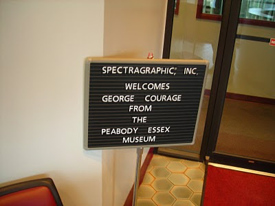
When I was still working at the Peabody Essex Museum in Salem, one of my regular duties was to travel to Long Island, New York to supervise the printing of the bi-monthly members magazine. Press checks, in general, are not much fun but I actually really enjoyed doing this one. This was largely due to the talents of the sales representative for the New York-based company that printed the magazine, a man named Larry Whitten. Larry, who was from Long Island but lived in Andover, was our dedicated rep from the very start of our working relationship with Spectragraphics. He was a frequent visitor to our offices, and handled all aspects of the production, from color adjustment and retouching, to general trouble-shooting.
For the press checks, he would arrive at my house early in the morning and drive us down to New York. Larry was a very affable, energetic and upbeat man, and we would often chat away the time as we drove from Boston to Connecticut. We would take the ferry from New London to Orient Point and drive to Comack where the main printing facility was. Sometimes the ferry ride could be a bit scary, such as on my first trip down during a February winter storm with surface conditions so rough that the captain of the ferry requested us to sit or lay down in our seats for the duration of the journey. I spent the rest of the day a little green around the gills. My job was to make certain that the printed page matched the color approved on the final proof. This could be a bit tricky as the pages printed on a form containing 8 pages above and below each other, and the color on the upper part of the page could affect how the color appeared on the page below it. For example if you had a solid block of red as a page design element directly adjacent to a photo with a lot of people's faces in it. The red could make the faces appear as if everyone had a sunburn. But all the pressmen at Spectragraphics were excellent, and very good at correcting for such instances. This made my job a lot easier than it might otherwise have been. Press checks can be really boring, a lot of your time on a press check is spent waiting for a sheet to be ready for you to look at. There is a lot involved in prepping files, setting up the job and the sheet-fed press, and getting the ink balance and color to a point where it is optimal. Sometimes pressmen, like mechanics, can be intimidating or resistant to input, but at Spectra, they were friendly and co-operative.
The press checks usually took a day and a half, which meant that I would stay overnight in a hotel located near the printer overnight. This provided opportunities to sample the cuisine of many of the restaurants in Comack and the immediate area. I had my first and last White Castle burger as well as one of the best steaks I've ever eaten on one of these trips. Excellent customer service made what could have been a very tedious experience into one that was actually enjoyable.
Printers and vendors, take note...
Tuesday, July 13, 2010
Toy Soldiers
Another project that I have been working on for several months, are a series of illustrations for Glencoe Models, a company that produces and distributes a variety of plastic model kits and toy soldiers. The owner needed some new art for two different boxes of soldiers, French WWI infantry, and South African Zulu Warriors. The client said that one of the complaints about box art is that the painting rarely shows the actual poses that are found on the figures in the box. He wanted to me to do something that was a realistic-looking scene, but at the same time, as accurate as it could be to the actual poses of the figures. He sent me samples of both of the soldiers. Progress has been slow, as the soldiers are mono-colored, and I had to research both the details of the uniforms and equipment, as well as the probable landscape that they would be found in. I then had to blend what the historical record had to say with the actual appearance and detail of the soldiers. I shot some photo reference for the soldiers. Then I tried to imagine what kind of landscape and groupings the figures would look natural in.
Since there were only 4 poses per French set, I had to bet creative with the arrangement.On the the French Infantry, i stuck to keeping the four main figure poses in the foreground. It seemed sensible that there would be only one officer, so that was easy. Having him direct the gunfire of the two firing soldiers also seemed pretty straightforward, however what to do with the one marching was a little tricky. I was also able to add smaller figures in various poses in the background.
On the Zulus, it was little more difficult as there are only 3 poses per set. Again, I followed a layout and landscape that seemed logical for the poses.
These sketches are the result. Once the client approves the sketches, I will execute a finish of each in acrylic. They will be more finished and contain more detail than the sketches.
Monday, July 12, 2010
Children's Book Update
An update on the book that my wife Amy and I have been working on, off-and-on, (mostly off) for almost 2 years. We were able to work on it over vacation, and finally completed a first version of the dummy, with sketches and text pasted into place. We've read it out loud and shared it with a few friends. The reaction has been pretty positive. The overall structure seems to flow pretty well, but we've tightened the focus of the story, and our research into the 18th-century pepper trade has shown us the need for a fairly major revision in the storyline.We also have some areas where we can expand the story.The next step is for Amy to make the story revisions and for me to revise the sketches further, so that it is very clear what the action is, and produce a couple of more finished illustrations, I did a finished wrap-around color rough for the cover.
It's starting to come together, ever so slowly...
Friday, July 9, 2010
Robin Hood Shirts
Came across these the other day buried in the bottom of a closet. Several t-shirts designs that I did for Pastimes Entertainment for the now defunct Robin Hood Faire at Hammond Castle. Pastimes used to produce a t-shirt for each of the shows, which were sold at the faire, and wound up with cast and crew members alike. They never made much money, but they were a cool reminder of some very fun shows. I kinda miss doing them.
Thursday, July 8, 2010
The Zero Effect
I was going through some of my old VHS tapes last night and came across a movie that I haven't watched in several years. Popped it in and found that it was just as good as I remembered it. I am referring to "The Zero Effect"(1998) Written and directed by Jake Kasdan (son of Director Lawrence Kasdan) the movie is a modern-day detective story loosely based on the Sherlock Holmes story "A Scandal In Bohemia". Bill Pullman stars as Daryl Zero, a brilliant but eccentric, and very reclusive detective. Like Sherlock Holmes, he is only truly at his best when working on a case. When not working he secludes himself in his high-security apartment, writes and performs terrible songs, drinking Tab and eating Tuna from a can. Like Holmes, he also has a bit of a drug habit, taking amphetamines to keep his mind "sharp". His "Watson" is operative, associate and front man Steve Arlo (Ben Stiller). They are hired by wealthy businessman Gregory Stark (Ryan O'Neill) ostensibly to find his missing keys, but there is much more to the case than meets the eye and soon Arlo and Zero are immersed in a plot involving rape, murder, and blackmail. The movie is handled with a light and deft touch. The darker material never overwhelms the charm and light comic appeal of the main characters.
There are several things I really like about this film. Number one is Bill Pullman's brilliant performance. I often think of Bill Pullman as a bit of a lightweight in the acting department, but he really delivers the goods in this film. His character is an eccentric, ego-centric and troubled genius who borders on being an asshole, but you never find him to be so obnoxious as to be unappealing, because there is real intelligence, humor and a hint of vulnerability in Pullman's portrayal. His chemistry with Arlo (Ben Stiller, playing it mostly straight for once), is also very good. Much like the relationship between Holmes and Watson, their relationship is a strange male dance of admiration mutual need, and irritation. Like Watson, Arlo has a girlfriend, and she is getting tired of his prolonged absences and strange demands of his job . She thinks their relationship is "weird" and wants Arlo to leave Zero's employ. I couldn't help but make comparisons between the dynamics of this relationship triangle, and the interpretation of the same relationship in the recent "Sherlock Holmes". The relationship between Arlo and Zero actually feels truer to the original source material.
But the real heart of this movie is the developing relationship between Zero, and and the blackmailer Gloria Sullivan (Kim Dickens). Dickens plays her as a genuine and multi-faceted person, truly admirable in her determination, and intelligence, in spite of the fact that she is a blackmailer. Gloria essentially is the Irene Adler character of the story, and as in the original story, Zero/Holmes develops an admiration and empathy for the blackmailer. Starting as an adversary, Gloria and Daryl slowly develop from an almost offhanded initial meeting, to mutual attraction and respect. This, more than the mechanics of the blackmail plot, is where the film pays off. Their relationship draws Zero temporarily out of his shell, and helps to humanize his character. It is this that makes us care for this eccentric and brilliant man.
This movie came and went at the box office in 1998, and was largely overlooked by audiences, although critics , including Siskel and Ebert gave it "Two thumbs up, way up!".
If you get a chance check it out as a rental or on Netflix. I strongly recommend it.
Sunday, July 4, 2010
My Strange Sense of Humor
As part of the "having fun with drawing" I came up with these sketches. The Cute/Evil idea was the result of noticing the juxtaposition of a German-made Steiff teddy bear, and a model of a WWII German Panzer Tank on my bookcase shelf. They just seemed to go together.
The "Nose of Sauron" came about thinking of replacing the "Eye" in The Lord of the Rings with another body part. You just never know where your mind is going to go.
Drawing for Fun
You can turn anything into a chore, including drawing. Lately, I have been so focused on drawing for an end purpose, that I forgot about just drawing for fun. Drawing needs to be fun, because when you are having fun with it, your brain comes up with all sorts of odd things, strange connections, and just plain goofiness. Today I was goofing around with an old drawing pad, and just drawing what popped into my head. Nothing great produced, but I was having fun. Kids know how to do this instinctively. Kids don't worry about making great or meaningful art, they just draw. Someone said that "genius is the ability to remember childhood at will". I believe that. Sometimes you just need to forget what people might think, or about producing a "product" and just go with whatever pops into your head. Follow where it leads. You may not come up with anything profound, but if you are enjoying the process, maybe that's not so important.
Subscribe to:
Posts (Atom)