It's a lonely life...that of the necromancer, er freelancer

A blog by a designer and illustrator, for designers and illustrators which may contain musings on art, movies and random weirdness.

Tuesday, December 21, 2010

The Dickens You Say!

A client recently hired me to do some Photoshop work on a photo so that it could be printed and given as a Christmas gift. I'm posting this partly to show what I am capable of doing in Photoshop, nothing too fancy, but definitley took an artist's eye.

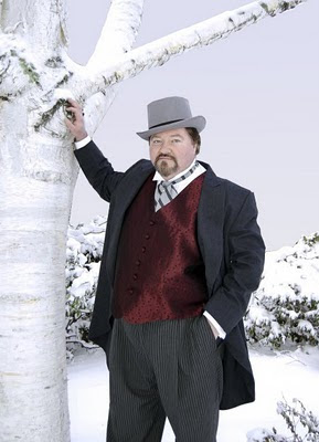
Here is the original photo. It is a picture of actor J.T. Turner, who does an annual reading of Charles Dicken's "Christmas Carol" as who else, Charles Dickens. He had this lovely photo taken of himself in his 19th-century Dickensian costume, the only problem was the decidedly 20th-century building in the background.


It was fairly easy to isolate the foreground elements and eliminate the background, replacing it with color sampled from the snow shadow area.


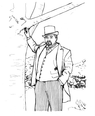
So far, so good. Now the client asked me to make it look more like an illustration, similar to a technique that I developed for use on several posters. I couldn't do it by just by running a Photoshop filter on the original photo as that almost always looks like what it is; a Photoshop filter run on a photo. It needed to look more hand drawn than that. I solved the problem by making a line drawing of the photo, tracing a print of the photo on vellum, and then scanning it into Photoshop.


I then selected the white areas of the flat art, inversed the selection so that only the black was selected, and then copied and pasted the black line art onto a new
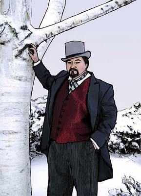
layer in Photoshop. I then took the original photo, ran a modified watercolor filter on it, and pasted it on the layer beneath the line art. Some areas of the line art did not line up exactly and needed to be modified, as did some of the areas of the underlying photo. For instance the area around the eyes needed to be cleaned up, and the side of the coat extended. Once everything was lined up to my satisfaction, i flattened the document. Here is the finished product.


You get the illustrative style of line art, with the tonal gradations of a photo.

Sunday, December 5, 2010

Firedrops!

A client of mine has been in the process of developing and marketing a product called "Firedrops". These are organic sugar drops loaded with cayenne pepper, which if taken at the first hints of a cold, will almost literally burn the sick right out of you. At first she made them in small batches at home, but they became so popular that she looked into having them manufactured in larger, industrial quantities. As she did this, she realized that they would need a definite identity. She asked me to help.

She liked the idea of a shield motif, as the drops were a "shield against colds".
She also wanted to convey how hot they were, as even the reduced strength drops were very hot, sweat-inducingly, tongue numbingly, hot. She also wanted a look that conveyed that the ingredients were all natural and organic.

I started by doing some sketches by hand.


I wanted to get down as many ideas as possible. Some ideas included a phoenix, or firebird motif, the possible use of a dragon as a mascot, a flaming meteor, and a throat showing the spreading warmth. Although she found some of the ideas intriguing, none of them were quite what she was looking for.

She tried doing a rough sketch herself. Here it is.


This took me in a different direction.The directness of picturing the cayenne pepper seemed like a good idea, but how to do it in a way that was visually interesting and conveyed the hotness of the drop. The sketch also seemed a bit text-heavy, but I gave it a shot. First I did research on cayenne pepper and the plant that supports it.


Working directly in Illustrator, I worked up several basic ideas. The first was just a simple reinterpretation of the shield motif.


This seemed kind of boring. So I started to add in the elements of flame, as well as the rest of the copy. Trying to find a balance of the elements of image, colors and text.


These ideas were well received, but some were eliminated, the rest were tweaked, refined and simplified.


This second round is where we left off, with me waiting for the client to pick an option. Which one do you like?

Saturday, November 6, 2010

Dragon Hunters


A few years ago, I had a very vivid dream in which men hunted dragons in the sky with flying boats. I was probably influenced by a trip to the Whaling Museum in New Bedford, MA., where I was amazed. impressed and horrified by the tools and practices of that trade. The image that stuck with me, was of men, in a small open whaleboat in open water, chasing and harpooning whales, that dwarfed the men and their boats, sometimes weighing in at 50 tons or more.
In the dream the hunters shot harpoons attached to weights into the dragons and eventually wore them down. Once the dragon was exhausted, they fell into the ocean, where the flying boats would land, and dispatch and dismember the dragon, much as the whales were hunted and slaughtered a century ago by whalers from Nantucket and New Bedford. Like the original whalers, the dragon hunters were a special class of men with their own habits, language and society.


After the dream, while the imagery was still fresh in my mind, I did some sketches, imagining the boats, the men, the costume, technology and the culture of these dragon hunters. At some point I would love to develop this idea further, but for now, here are some sketches and notes from my sketchbook.

Wednesday, October 27, 2010

Ideas and Unfinished Projects


These are some color sketches for a painting I have had in my head for a long time. It is a blind angel of the apocalypse, playing a mandolin in front of the ruins of a church.
Kinda weird. Can't decide what the color scheme, time of day or weather should be. Suggestions?

Wednesday, October 6, 2010

Unicorns and Dinosaurs

A few days ago I posted a political cartoon on FaceBook. I really liked the style and content of it. My friend Lola, a fellow blogger said " i love YOUR illustrations. back to your blog sir!" I was rightly chastised, as I have been very lazy about posting on my own blog the last couple of months and I told Lola I would draw something just for her and post it. She replied " after careful consideration, I decided that i would be most excited to see something that involves both a dinosaur and a unicorn". So here is what I have come up with, not one, but three ideas involving a unicorn and a dinosaur.


The first one is the most straightforward. It's an encounter between a unicorn and a T-rex. At first I had considered a raptor, as they are more in scale with a unicorn, but i liked the contrast in size, and the idea that a unicorn would actually take on
something 10 times its size.


The second one came to me as I started thinking about similarities between a dinosaur and a unicorn. Although the triceratops has 3 horns instead of one, I thought that of all the dinosaurs, it was the most similar to a unicorn. It's an imagined meeting of a fanciful and a kind of "real" unicorn.


The last one was a bit of humor. I know some people who are "young-earth creationists" and who believe that humans and dinosaurs existed together and that Noah's flood is what really wiped out the dinosaurs and "confused" the fossil record. So why not include a unicorn in that scenario, it seems appropriate somehow.

What do you think? Which one do you like? If this works out it may become a regular feature of the blog. Requests anyone?

Wednesday, September 8, 2010

Metropolis


Last Friday night I attended a viewing of Fritz lang's 1927 science-fiction masterpiece Metropolis at the Cinema Salem. It is "The Complete" version that restores the film to its almost-original condition, incorporating footage discovered in Buenos Aires in 2008. Nearly a half an hour has been restored into the film, seen here (almost) complete for the first time since the film’s Berlin premiere in 1927.
Immediately after the premiere, German distributor Ufa re-cut the film from 153 minutes to 114 minutes, and it was this version that was distributed internationally, including an American release through Paramount Pictures, who hacked even more content from the film to fit it into a 90 minute slot as well as to tone down the political themes at the core of the film. This is the version that had been available to audiences for nearly 80 years. The rest of the film — excised and unseen in decades — was considered lost.


The discovery of A 16mm complete collector’s print of the film in a film vault in South America was a major find for film enthusiasts. Aside from 8 minutes that were too badly degraded to restore, The Complete Metropolis is indeed, complete.

The last time I saw this film was in a college film class, and I remembered it as an assemblage of visually striking images and set pieces of epic scale and imagination, but the (then) poor quality of the film, and the somewhat confusing story caused me to dismiss it. That is not the case with the new version. The restored version is stunning and the additional footage not only clarifies the story, it also clarifies character action and motivation.


If you are not familiar with the story, Metropolis is a techno-utopia, a futuristic city, enormous and technically advanced, however there is a great social disparity. The leader of the city, Joh Frederson’s and the rich elite live lives of luxury and comfort in the upper levels of the city while a working underclass toil endlessly to service the machines that keep the city running, and live underground in the lowest levels of the city. The workers lives are bleak and exhausting. Their only hope comes in the form of a saintly girl named Maria who cares for the workers children. She tells of the coming "Mediator". A messiah-like figure who will act as an intermediary between the elite class and the working class. This turns out to be Joh Frederson's son Freder.
His conscience is awakened by an encounter with Maria, and he attempts to assist her in her mission to better the lives of the city's workers.


One of my favorite characters is the mad scientist Rotwang. He is a distinctive-looking man, with his shock of unruly hair, his long coat and gloved, artificial hand.


He creates an evil robot version of Maria, on the orders of Joh Frederson to undermine the worker's confidence in Maria and undo their social uprising. Unkown to Frederson, (and to us until this restored version of the film), is that Rotwang was in love with Frederson's dead wife and created the robot to take her place. When he is called upon to turn her into Maria, he does so with the intention of destroying Metropolis, Jon Frederson, and Freder. It is Rotwang's creation that is perhaps the most iconic image of the film, and sets much of the story in motion.


The scene where Rotwang transform the metal robot into the flesh-and-blood Maria is a masterful showcase of special effects, that for my money surpasses the even the creation scene in Frankenstein, which it predates by four years. Rotwang also figures prominently in some of the films most iconic shots.


This film is a virtual watershed of sci-fi imagery and themes and seems to be the inspiration for almost every major sci-fi movie of the twentieth century. Giant cityscapes, social commentary, a political struggle between the haves and have-nots, and between good and evil. Movies such as The Matrix, THX1138, Blade Runner, Dark City, Star Wars, and at least a dozen others.

Don't be deterred by the fact that this is an older, black and white and silent film. The images and themes are powerful, and the silvery black and white only deepens the dream-like quality of the film. I strongly recommend seeing this film.

Monday, August 16, 2010

Keeping the Spark Alive


My output as an artist has varied greatly through my life. Sometimes I have had periods of incredible productivity, followed by long dry spells of producing little or nothing of any significance. I am in one of those fallow periods now. I'm not talking about what you do for a living, what I do in my job as a Graphic Designer. I am talking about personal work, the projects that you dream about doing. The things you would do if you didn't have to earn a living.
As you get older, it gets harder and harder to believe that you will ever get one of these dream projects off the ground and bring it to successful completion. How do you keep the spark alive?
What gives me hope?
Through periods of productivity and non-productivity I have always maintained the habit of carrying a sketchbook and drawing in it daily. I have done this even through the worst personal experiences. This gives me hope. Ideas come to me every day. Ideas for images, ideas for stories, observations. Most of them are crap, but a good number of them are very good. Although I may lack the time, self-discipline or enthusiasm to bring them to a "finished" form, I have to get them out on paper. This is my most basic and irreducible creative drive. This is how I keep the spark alive. That I do this gives me hope when it seems like I have the artistic equivalent of performance anxiety, when completing a personal project feels like passing a kidney stone.

Will these little sketchbooks become "seeds" that will eventually grow into something more substantial? I don't know, but like anyone who keeps practicing their craft, even at a very basic level, I hope so.

Thursday, July 15, 2010

Press Checks and Good Customer Service


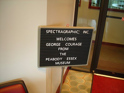
When I was still working at the Peabody Essex Museum in Salem, one of my regular duties was to travel to Long Island, New York to supervise the printing of the bi-monthly members magazine. Press checks, in general, are not much fun but I actually really enjoyed doing this one. This was largely due to the talents of the sales representative for the New York-based company that printed the magazine, a man named Larry Whitten. Larry, who was from Long Island but lived in Andover, was our dedicated rep from the very start of our working relationship with Spectragraphics. He was a frequent visitor to our offices, and handled all aspects of the production, from color adjustment and retouching, to general trouble-shooting.
For the press checks, he would arrive at my house early in the morning and drive us down to New York. Larry was a very affable, energetic and upbeat man, and we would often chat away the time as we drove from Boston to Connecticut. We would take the ferry from New London to Orient Point and drive to Comack where the main printing facility was. Sometimes the ferry ride could be a bit scary, such as on my first trip down during a February winter storm with surface conditions so rough that the captain of the ferry requested us to sit or lay down in our seats for the duration of the journey. I spent the rest of the day a little green around the gills. My job was to make certain that the printed page matched the color approved on the final proof. This could be a bit tricky as the pages printed on a form containing 8 pages above and below each other, and the color on the upper part of the page could affect how the color appeared on the page below it. For example if you had a solid block of red as a page design element directly adjacent to a photo with a lot of people's faces in it. The red could make the faces appear as if everyone had a sunburn. But all the pressmen at Spectragraphics were excellent, and very good at correcting for such instances. This made my job a lot easier than it might otherwise have been. Press checks can be really boring, a lot of your time on a press check is spent waiting for a sheet to be ready for you to look at. There is a lot involved in prepping files, setting up the job and the sheet-fed press, and getting the ink balance and color to a point where it is optimal. Sometimes pressmen, like mechanics, can be intimidating or resistant to input, but at Spectra, they were friendly and co-operative.
The press checks usually took a day and a half, which meant that I would stay overnight in a hotel located near the printer overnight. This provided opportunities to sample the cuisine of many of the restaurants in Comack and the immediate area. I had my first and last White Castle burger as well as one of the best steaks I've ever eaten on one of these trips. Excellent customer service made what could have been a very tedious experience into one that was actually enjoyable.
Printers and vendors, take note...

Tuesday, July 13, 2010

Toy Soldiers


Another project that I have been working on for several months, are a series of illustrations for Glencoe Models, a company that produces and distributes a variety of plastic model kits and toy soldiers. The owner needed some new art for two different boxes of soldiers, French WWI infantry, and South African Zulu Warriors. The client said that one of the complaints about box art is that the painting rarely shows the actual poses that are found on the figures in the box. He wanted to me to do something that was a realistic-looking scene, but at the same time, as accurate as it could be to the actual poses of the figures. He sent me samples of both of the soldiers. Progress has been slow, as the soldiers are mono-colored, and I had to research both the details of the uniforms and equipment, as well as the probable landscape that they would be found in. I then had to blend what the historical record had to say with the actual appearance and detail of the soldiers. I shot some photo reference for the soldiers. Then I tried to imagine what kind of landscape and groupings the figures would look natural in.


Since there were only 4 poses per French set, I had to bet creative with the arrangement.On the the French Infantry, i stuck to keeping the four main figure poses in the foreground. It seemed sensible that there would be only one officer, so that was easy. Having him direct the gunfire of the two firing soldiers also seemed pretty straightforward, however what to do with the one marching was a little tricky. I was also able to add smaller figures in various poses in the background.


On the Zulus, it was little more difficult as there are only 3 poses per set. Again, I followed a layout and landscape that seemed logical for the poses.
These sketches are the result. Once the client approves the sketches, I will execute a finish of each in acrylic. They will be more finished and contain more detail than the sketches.

Monday, July 12, 2010

Children's Book Update


An update on the book that my wife Amy and I have been working on, off-and-on, (mostly off) for almost 2 years. We were able to work on it over vacation, and finally completed a first version of the dummy, with sketches and text pasted into place. We've read it out loud and shared it with a few friends. The reaction has been pretty positive. The overall structure seems to flow pretty well, but we've tightened the focus of the story, and our research into the 18th-century pepper trade has shown us the need for a fairly major revision in the storyline.We also have some areas where we can expand the story.The next step is for Amy to make the story revisions and for me to revise the sketches further, so that it is very clear what the action is, and produce a couple of more finished illustrations, I did a finished wrap-around color rough for the cover.
It's starting to come together, ever so slowly...

Friday, July 9, 2010

Robin Hood Shirts


Came across these the other day buried in the bottom of a closet. Several t-shirts designs that I did for Pastimes Entertainment for the now defunct Robin Hood Faire at Hammond Castle. Pastimes used to produce a t-shirt for each of the shows, which were sold at the faire, and wound up with cast and crew members alike. They never made much money, but they were a cool reminder of some very fun shows. I kinda miss doing them.

Thursday, July 8, 2010

The Zero Effect


I was going through some of my old VHS tapes last night and came across a movie that I haven't watched in several years. Popped it in and found that it was just as good as I remembered it. I am referring to "The Zero Effect"(1998) Written and directed by Jake Kasdan (son of Director Lawrence Kasdan) the movie is a modern-day detective story loosely based on the Sherlock Holmes story "A Scandal In Bohemia". Bill Pullman stars as Daryl Zero, a brilliant but eccentric, and very reclusive detective. Like Sherlock Holmes, he is only truly at his best when working on a case. When not working he secludes himself in his high-security apartment, writes and performs terrible songs, drinking Tab and eating Tuna from a can. Like Holmes, he also has a bit of a drug habit, taking amphetamines to keep his mind "sharp". His "Watson" is operative, associate and front man Steve Arlo (Ben Stiller). They are hired by wealthy businessman Gregory Stark (Ryan O'Neill) ostensibly to find his missing keys, but there is much more to the case than meets the eye and soon Arlo and Zero are immersed in a plot involving rape, murder, and blackmail. The movie is handled with a light and deft touch. The darker material never overwhelms the charm and light comic appeal of the main characters.


There are several things I really like about this film. Number one is Bill Pullman's brilliant performance. I often think of Bill Pullman as a bit of a lightweight in the acting department, but he really delivers the goods in this film. His character is an eccentric, ego-centric and troubled genius who borders on being an asshole, but you never find him to be so obnoxious as to be unappealing, because there is real intelligence, humor and a hint of vulnerability in Pullman's portrayal. His chemistry with Arlo (Ben Stiller, playing it mostly straight for once), is also very good. Much like the relationship between Holmes and Watson, their relationship is a strange male dance of admiration mutual need, and irritation. Like Watson, Arlo has a girlfriend, and she is getting tired of his prolonged absences and strange demands of his job . She thinks their relationship is "weird" and wants Arlo to leave Zero's employ. I couldn't help but make comparisons between the dynamics of this relationship triangle, and the interpretation of the same relationship in the recent "Sherlock Holmes". The relationship between Arlo and Zero actually feels truer to the original source material.


But the real heart of this movie is the developing relationship between Zero, and and the blackmailer Gloria Sullivan (Kim Dickens). Dickens plays her as a genuine and multi-faceted person, truly admirable in her determination, and intelligence, in spite of the fact that she is a blackmailer. Gloria essentially is the Irene Adler character of the story, and as in the original story, Zero/Holmes develops an admiration and empathy for the blackmailer. Starting as an adversary, Gloria and Daryl slowly develop from an almost offhanded initial meeting, to mutual attraction and respect. This, more than the mechanics of the blackmail plot, is where the film pays off. Their relationship draws Zero temporarily out of his shell, and helps to humanize his character. It is this that makes us care for this eccentric and brilliant man.

This movie came and went at the box office in 1998, and was largely overlooked by audiences, although critics , including Siskel and Ebert gave it "Two thumbs up, way up!".
If you get a chance check it out as a rental or on Netflix. I strongly recommend it.

Sunday, July 4, 2010

My Strange Sense of Humor


As part of the "having fun with drawing" I came up with these sketches. The Cute/Evil idea was the result of noticing the juxtaposition of a German-made Steiff teddy bear, and a model of a WWII German Panzer Tank on my bookcase shelf. They just seemed to go together.
The "Nose of Sauron" came about thinking of replacing the "Eye" in The Lord of the Rings with another body part. You just never know where your mind is going to go.

Drawing for Fun

You can turn anything into a chore, including drawing. Lately, I have been so focused on drawing for an end purpose, that I forgot about just drawing for fun. Drawing needs to be fun, because when you are having fun with it, your brain comes up with all sorts of odd things, strange connections, and just plain goofiness. Today I was goofing around with an old drawing pad, and just drawing what popped into my head. Nothing great produced, but I was having fun. Kids know how to do this instinctively. Kids don't worry about making great or meaningful art, they just draw. Someone said that "genius is the ability to remember childhood at will". I believe that. Sometimes you just need to forget what people might think, or about producing a "product" and just go with whatever pops into your head. Follow where it leads. You may not come up with anything profound, but if you are enjoying the process, maybe that's not so important.

Wednesday, June 16, 2010

Miranda (1948)


As many of you know, I am obsessed with mermaids, and mermaid movies. Since there is a definite scarcity of good mermaid movies, (the abysmal adaptation of Aquamarine being one example of not good) I feel compelled to call attention to a good one when I come across it.
When the movie is an older, British-made, black and white gem, even more.
Which brings me to Miranda.


Miranda was made in 1948, directed by Ken Annakin, who also directed Swiss Family Robinson, the madcap comedy Those Magnificent Men in Their Flying Machines and the World War II epic The Longest Day. It is based on a successful stage play by Peter Blackmore, who adapted it for the screenplay.
I have had a soft spot for this story since my high school drama class did a production of the play, which I saw and read. I loved it and was obsessed with seeing the film version, however I was never able to as it is rarely on TV and there are no official DVD versions available in the US, unless you find a DVD-R copy (usually recorded off of a broadcast such at Turner Classic Movies) or can find it online. As it so happens, after much searching, I found it online, so after 30 years I was finally able to see the film. I must say it was worth the wait.


The plot goes something like this...With his wife uninterested in fishing, Dr. Paul Martin (Griffith Jones) goes on holiday to the Cornwall coast by himself. While there fishing, he snags Miranda (Glynis Johns), a real mermaid, and is pulled into the water. He's knocked unconscious, and awakens in her cave. Their first exchange is one of my favorites and sets the tone immediately. When he asks how he got there, she tells him that he "Fell out of his boat"
"Pulled is more like it" he replies.
Without missing a beat she quips "You're a terrible swimmer".
She keeps him prisoner in her underwater cavern and only lets him go after he agrees to show her London. She has always wanted to see Buckingham Palace, Billingsgate Market and most especially, the opera. He disguises her as an invalid patient in a wheelchair and takes her to his home for a month-long stay.


Martin’s wife Clare (Googie Withers) reluctantly agrees to the arrangement, but once she learns that the "patient" is an attractive young woman rather than an elderly one, convinces him to hire someone to look after their guest. He selects Nurse Carey (Margaret Rutherford) for her eccentric nature and takes her into his confidence. To Paul's relief, Carey is delighted to be working for a mermaid.

Miranda’s seductive nature earns her the admiration of not only Paul, but also his chauffeur Charles (David Tomlinson) and Nigel (John McCallum), the fiancé of Clare's friend and neighbour Isobel (Sonia Holm), arousing the jealousy of the women in their lives. Nigel breaks off his engagement, but when he and Charles discover that Miranda has been flirting with both of them, they come to their senses.

Clare finally figures out what sort of creature Miranda really is. Miranda overhears her telling Paul that the public must be told. Since Miranda had a mermaid aunt who was captured and pickled, she wheels herself down to the river and makes her escape.

The movie moves along at a rather brisk pace. Some movies like this spoil themselves by going on too long, if anything this one, at 80 minutes, is too short.

The film's chief asset is its casting. Glynis Johns is simply wonderful as Miranda, and she's a good part of the reason the film succeeds. She later became immortalized in film by playing the mother in Mary Poppins, along with David Tomlinson. She's a joy to watch here, but she's hardly the only one. The film makes excellent use of Googie Withers, as Paul's haughty wife Clare, David Tomlinson as his glum chauffeur, by the chauffeur's girlfriend Betty, also the maid, played by Yvonne Owen, and, especially, Margaret Rutherford as Miranda's eccentric and devoted nurse.

Having been based on a stage play, the film sometimes seems in some ways oddly constrained. Surprisingly little goes into exploiting the story's potential for visual comedy, nor into showing how Miranda fares outside of domestic interiors. For this we get only two short sequences: one in which she gorges on a street-vendor's entire stock of cockles, and the great scene in which she catches a fish in her mouth during feeding time at the zoo. This curious reticence may in part have been dictated by the limiting nature of Johns' prosthetics, though what little we see of her tail (made by Dunlop, according the credits) looks entirely convincing. However, I think this constraint actually adds to its charm. One can only imagine how this could be mucked-up in an American, CGI-laden remake.


Another surprise is the mild, but nevertheless stunning raciness of the film. Miranda is an outrageously flirtatious, nearly-nymphomaniac mermaid, very open about her attraction to men, who likes being kissed, carried and admired. When Clare ponders Miranda's various eccentricities - she sleeps in a cold bath, drinks salt water, eats raw fish sandwiches, the most horrifying is, "she never wears panties!" There is also a scene in which, while out for a night-time drive in the county, Paul and Miranda come across a lake, and take an impromptu, and apparently nude swim. There is also the matter of the final scene of the movie, where, Miranda
is shown on a rock, holding a little merboy on her lap. Where did he come from?
(My guess is from the night-time swim with Paul). Although exceedingly mild by today's standards, this seems incredible in a movie made in 1948!


While watching the film, I couldn't help making the inevitable comparisons with the movies
Mr. Peabody and the Mermaid, and Splash, (both favorites of mine) several scenes play in a very similar manner, and both try for the same light tone, but they aren't nearly as charming as this. Miranda retains considerable charm and novelty, and was successful enough to prompt a sequel, Mad About Men (1954).
Miranda is not a perfect film by any means, mostly due to it's short length and cheap rear projections in some outdoor scenes, but I haven't been so delighted by a film in a long time.

I am hoping that someone will give this semi-obscure gem a decent DVD release.
Is anyone at Criterion listening?